You start with a background. Then a text color. Then the brand color needs a darker version for hover. The form needs red for errors. Success needs green. Cards need […]
Read More
You start with a background. Then a text color. Then the brand color needs a darker version for hover. The form needs red for errors. Success needs green. Cards need […]
Read More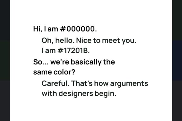
Black text on a white background sounds like the easiest color decision in design. Choose #000000. Done. Except there is a surprising amount of room between pure black and something […]
Read More
Open a new website project and one of the first decisions looks almost suspiciously easy: What color should the page be? White is safe. Black text is readable. Done. Except […]
Read More
Sometimes the colors you need are already right in front of you. You may have a wedding photograph with soft sage leaves, warm skin tones and an old stone wall. […]
Read More
Sometimes you do not need more inspiration. You already have the color. Maybe it is the blue in your logo. A green you keep coming back to. A warm orange […]
Read More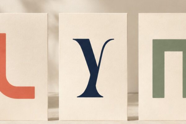
A text color can have excellent contrast and still be surprisingly hard to read. Because we do not read contrast ratios. We read letters. And the size, weight and shape […]
Read More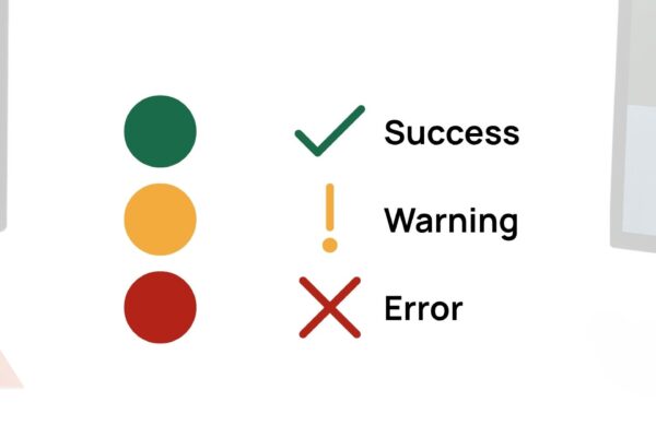
Green means success. Red means error. Blue means link. Usually. But color meanings are learned, contextual and not always perceived in the same way. A green dot may look obviously […]
Read More
Black text on a white background works. Very well, in fact. But that does not mean every paragraph, heading, label and button on your website needs to be dressed in […]
Read More
Color can say a lot without saying anything. A deep blue can feel calm in one palette and serious in another. Red can suggest energy, love, danger, confidence or urgency. […]
Read More