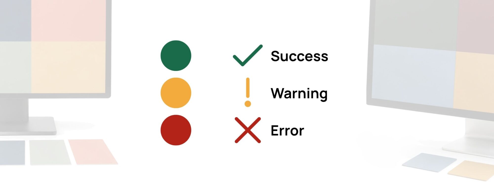
Green means success.
Red means error.
Blue means link.
Usually.
But color meanings are learned, contextual and not always perceived in the same way. A green dot may look obviously different from a red one to you and much less distinct to somebody else.
The screen matters too. So does brightness, sunlight, surrounding colors and the size of the thing you are trying to see.
Color is useful. It is just a terrible employee to leave working alone.
Color can suggest meaning
We use color because it communicates quickly.
Red can attract attention.
Green can suggest that something went well.
Blue can make a link or action feel familiar.
Yellow and orange often appear around warnings.
Those associations can be genuinely useful. They help people scan an interface and recognize patterns without reading every word. But an association is not the same thing as information.
A red border may suggest that something is wrong. It does not tell you what went wrong.
A green circle may look positive. It does not necessarily tell you whether an order was paid, shipped, approved or simply selected.
And as explored in Color Meanings: What Colors Can Communicate, colors do not have one fixed universal meaning. Their associations change with shade, context, culture and the colors around them.
That makes color excellent supporting information. It also makes it risky as the only information.
Use color as a signal. Give the signal backup.
What does WCAG 2.2 say about color?
WCAG stands for Web Content Accessibility Guidelines. They are accessibility guidelines from the W3C for making websites and other digital content usable by more people.
One of those requirements is called Use of Color.
The idea behind it is pleasantly simple:
Do not make color the only visible way someone can understand important information, recognize an action or tell elements apart.
That does not mean you should stop using color.
Quite the opposite.
Use the red error color.
Use the green success color.
Use the blue selected state.
Just provide another clue when the distinction matters.
That clue might be:
- a label;
- an icon;
- a different shape;
- an underline;
- a border;
- a pattern;
- a position or layout change;
- clear explanatory text.
Color gets to help. It just does not have to explain everything by itself.
This is about much more than text
The principle appears all over an interface.
Imagine a form.
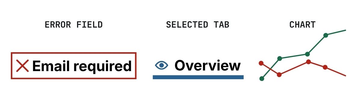
A required field has been left empty and its border turns red.
Someone who notices the red immediately knows where to look.
Useful.
Now add:
Email address
Please enter your email address.
and an error icon.
The color still helps people scan the form, but the meaning no longer disappears if that red border is difficult to perceive.
The same idea works elsewhere.
Status messages
Instead of:
🟢
🟠
🔴
use:
✓ Success
! Warning
× Error
The colors can remain. They make the statuses quicker to scan.
But the icons and words carry the meaning too.
Selected and active states
Suppose three navigation tabs are gray and the selected tab becomes blue. That may look perfectly obvious.
But you can make the state stronger by adding an underline, a heavier weight, a border or another visible treatment.
Now selection is not encoded in hue alone.
Charts
A chart with a blue, green, purple and red line may look wonderfully clear on your monitor. Remove the legend and make the colors harder to distinguish and things become more interesting.
Different line styles, markers or direct labels give every series another identity:
— Revenue
— Costs
● Forecast
The colors can still make the chart attractive and fast to scan. They just have some help.
Maps and diagrams
The same principle applies to maps, schedules, diagrams and heatmaps.
If green means available and red means unavailable, consider adding a symbol, label or pattern.
If several regions on a map represent different categories, color can be combined with labels, boundaries or patterns.
The goal is not to remove color.
It is to make the information survive without perfect color perception.
Contrast and color vision are different questions
This is where two accessibility ideas are easily mixed together.
Contrast asks:
Can an element be distinguished clearly enough from what sits behind or beside it?
Color vision asks:
Can the color relationships still be distinguished when colors are perceived differently?
They are related.
They are not interchangeable.
For example, two status colors might each have enough contrast against a white background. That does not automatically mean those two status colors are easy to tell apart from each other.
And two colors may look dramatically different in hue while still having weak light–dark contrast.
That is why Qolorio provides separate tools.
The Color Contrast Checker tests a foreground/background relationship and shows its contrast ratio.
The Color Vision & Palette Checker lets you inspect how relationships within a palette may change under different color-vision simulations.
A simulation is not a medical test and it cannot predict exactly how every person sees color.
It is a design check.
If an important distinction becomes difficult to see, ask a useful question:
Would the design still make sense if the colors became harder to tell apart?
If the answer is no, add another signal.
There is also contrast beyond text
Contrast requirements are not limited to paragraphs and headings.
WCAG 2.2 also has a requirement for non-text contrast.
Important visual information used to identify interface controls, their states and meaningful parts of graphics generally needs sufficient contrast against adjacent colors.
A useful number to remember here is 3:1.
That can matter for things such as a control boundary, a focus indicator, a checked state or a graphical element that someone actually needs in order to understand the content.
It does not mean every decorative border and icon on a website has to reach 3:1.
Decoration is decoration.
The requirement is about visual information people need in order to understand or use something.
That distinction matters.
Links deserve more than “slightly bluer”
Links inside body text are a particularly good example.
First, the link text needs to remain readable against its background.
But there is another question:
Can someone tell that it is a link?
Changing dark gray text to slightly blue text may be obvious to some readers and almost invisible to others.
An underline solves a surprising amount of this problem.
It gives the link a second visual property that does not depend on recognizing the hue.
The humble underline has survived decades of web design for a reason.
Errors should explain themselves
Errors are another place where color is often asked to do too much.
Imagine an email field that turns red when something goes wrong.
The color draws attention. That is useful.
But red alone does not explain the problem.
Compare:
Color only
The email field gets a red border.
Color + explanation
The email field gets a red border and a message:
Enter a valid email address.
The second version is not only more accessible. It is more helpful.
The user does not have to interpret what the color means, guess what went wrong or search elsewhere for instructions.
Show the state. Explain the state.
Success should explain itself too
Accessibility discussions often focus on errors, but positive states benefit from the same thinking.
A green border around a completed field may be useful.
A green check plus Complete is clearer.
A green notification may attract the eye.
Payment received tells someone what actually happened.
Again, color is still doing useful work.
It is just no longer responsible for the entire conversation.
Accessible palettes are starting points
You can design a palette with strong contrast relationships and colors that remain reasonably distinct across several color-vision simulations.
That is a good start.
It is not a certificate.
The moment those colors receive jobs, new relationships appear.
A green that worked beautifully as an accent may become body text.
A blue may become a button.
A subtle border may become the only thing separating a form field from its background.
A palette that looked distinct as large swatches may behave very differently when those colors become tiny chart markers.
Accessibility therefore belongs in the implementation, not just the palette.
Test the colors where they are actually used.
Give important information two ways to speak
A useful rule of thumb is:
If losing the color would make the meaning disappear, add another signal.
Red + error message.
Green + check + Success.
Blue + underline for a link.
Selected color + border or indicator.
Chart color + marker or label.
Map color + pattern or text.
None of those combinations makes color less useful.
They make the design more resilient.
And often easier for everyone to understand.
That is the interesting part: accessibility does not have to mean designing a duller interface.
You can still use color for personality, hierarchy, emotion and speed.
Just do not make someone pass a color-recognition test before they can use the product.
Use color to reinforce meaning. Do not make it responsible for meaning.
Have a palette where several colors need to stay distinguishable? Check it with the Color Vision & Palette Checker.
And when foreground and background need to work together, check the actual pair with the Color Contrast Checker.