LIVE DEMO · COLOR SYSTEMS IN CONTEXT
Live Website Color Designer
Shape a compact color system, then watch it work through a real website, an editorial story, a workspace and a shop.
Start with Colors, then inspect your choices through the floating menu – calmly, clearly and without opening twelve tabs.
COLOR IS A DECISION SYSTEM
Make every color choice earn its place.
A website color system should do more than look good in a row. It should establish hierarchy, keep reading effortless and make every interaction feel intentional.
Start with jobs
Each picker changes one named responsibility, so the system remains explainable after the exciting part.
See it in use
Switch views to meet the same colours in marketing, editorial, product and shop contexts.
Keep the proof
Contrast, locks, sharing and exports turn a direction into something another person can use.
HOW THE LIVE DEMO WORKS
Good color has a job description.
Start with a compact foundation, then let optional interaction states borrow those colours intelligently. The result stays lean enough to remember and detailed enough to build from.
- 01Set the stage. Open Colors for Page Background, Surface and Inverse Surface.
- 02Make reading effortless. Heading, body and inverse text are checked in the places they really appear.
- 03Choose a voice. Open Fonts to give headings, secondary headings and body copy their own readable character.
- 04Change the context. Use Views for Website, Story, Workspace and Shop – one system, four honest tests.
- 05Let the system respond. Optional hover, focus and inactive states reuse a foundation colour rather than inflating the palette.
- 06Keep a useful surprise. Lock a role, use Surprise, then use Undo if you miss the previous direction.
- 07Verify and continue. Open Contrast, Share the URL, Export the roles or send the system to Studio.
one readable visual grammar
not one lucky landing page
with every Surprise
every value has a job
NOT HERE TO DECORATE THE INTERFACE.
Here to make it work.✦Pass on a working colour decision, not a beautifully labelled mystery.
Open the role guide below →FIELD NOTES FROM THE IMAGINARY USABILITY LAB
What fictional people notice first.
I stopped calling every colour ‘the brand blue’ and started giving them actual jobs. Apparently that helps.
It found the awkward contrast before I could call it ‘intentionally understated’. Unhelpfully useful.
I found a direction in minutes and still had time to pretend it took a week.
STORY VIEW · READING IN CONTEXT
Colour is a promise your interface has to keep.
A practical note on turning a beautiful direction into a system people can read, navigate and trust.
Good colour decisions do not begin with a color picker. They begin with a question: what does this part of the page need to do?
Give the eye somewhere to land.
Background and text do the quiet work. Actions, links and accents arrive later, with enough distinction to be found without being asked twice.
“Make the page useful first. Then make it memorable.”
--primary-action: #0068FF;
--text-on-inverse: #F7FBFF;
Keep the signal legible.
Switch to another view and the same decisions meet different pressures: a dense workspace, a product card or a long reading experience.
WORKSPACE VIEW
System health
Role coverage
Every visible bar is a demo, but every colour is your active system.
Recent checks
SHOP VIEW · COMMERCE IN CONTEXT
Objects with
room to glow.
Three neutral, Qolorio-styled product studies. Try the colours on product cards, price hierarchy and a small purchase moment.

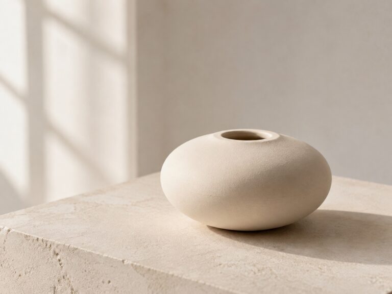

Small-batch studies for an imaginary shop. The buttons are demos; the colours are very real.
A palette is not a website yet
Ten beautiful swatches can still create a confusing button, an unreadable dark mode or a focus state nobody can find. Color becomes useful when it has a clear job and a real place to do it.
Qolorio Live Canvas is a focused companion for a quick website color preview. It turns ten essential color roles into a live website, so you can change a role, switch the context and inspect the result before deciding whether the direction deserves a fuller Color Studio project.
Choose the jobs. See the website. Keep the evidence.
How to use Live Canvas
Live Canvas is designed to be explored in a few clear steps. The preview is the main event; the floating controls change the system around it.
- Start with the canvas. Select Get started. The floating menu gently points to Colors, where you can set the page, surface and reading colors first.
- Edit the jobs, not random swatches. Open Colors, type a HEX value directly or use the square color picker. Each control changes one named role in the preview.
- Keep the decisions that work. Lock a role before choosing Surprise. Live Canvas generates a new safe direction around the locked colors. Use Undo or Redo in the preview header whenever you want to compare.
- Change the pressure, not the system. Open Views to see the same colors in a website, Story, Workspace or Shop. Use the desktop/mobile symbol to inspect both preview widths.
- Check the relationships. Open Contrast to inspect every displayed foreground/background relationship with a small visual example and its required ratio.
- Bring type into the decision. Open Fonts and choose separate styles for headers, secondary headers and body text.
- Take the direction forward. Share the exact setup, export the roles or open Color Studio when the direction needs more room to grow.
On desktop, the controls sit in a floating bar at the bottom of the viewport. On smaller screens, Colors and Fonts stay easy to reach while the supporting actions become compact icon buttons. Every control has a label for assistive technology and can be used with a keyboard.
Ten colors, ten clear roles
Live Canvas starts with the parts of a website that need a deliberate color decision. The goal is not ten unique colors at all costs. Several roles can sensibly share one value. The goal is ten clear responsibilities.
- Page Background, Surface and Inverse Surface establish the canvas, raised areas and deliberate dark moments.
- Heading Text, Body Text and Text on Inverse protect readable content and hierarchy.
- Primary Action, Secondary Action and Accent create hierarchy without making every element shout.
- Link keeps navigation and editorial connections clear.
Each role is mapped to its own job in the live preview. Body Text changes the reading color, not an unrelated panel. Inverse Surface changes the dark information areas. This keeps a compact palette explainable after the exciting part.
A useful color is not just a value. It is a value in a relationship.
Optional interaction states
Hover, selected, focus and inactive states are available when a project needs extra control. They deliberately reuse one of the ten foundation colors, so the system stays lean instead of quietly becoming a 31-color accident. You can choose the source color for Primary Action Hover, Secondary Action Hover, Link Hover, Selected / Active, Focus Ring and Disabled / Inactive.
Preview a real interface, not a strip of swatches
One system is shown in four deliberately different contexts. The Website view tests marketing hierarchy, copy and calls to action. Story tests long-form reading, editorial links and typography. Workspace adds denser product UI, selected states and data. Shop adds products, prices and small purchase moments.
The views are interactive design contexts, not destinations. Their buttons and links are clearly marked as demos. The colors, type, responsive width and contrast relationships are the parts that are real.
Use Desktop and Mobile to change the preview width. Switching a view or device returns you to the top of the preview, so the result is immediately visible.
Give light and dark their own logic
Dark mode is not a filter laid over a light website. Light and Dark are two independent ten-role systems inside the same Live Canvas direction. Switch modes to edit the page, surfaces, reading colors and actions where they actually need different logic.
Both systems travel together in the shareable configuration, so you can compare directions without losing the work already done.
Surprise yourself. Keep the evidence.
Choose Surprise when you want a fresh starting point without starting from scratch. Live Canvas creates a complete color direction that already works across the preview, so you can react to a real website instead of guessing from loose swatches.
Lock any role you want to preserve, then generate around it. If the locked values cannot produce a safe result together, Live Canvas tells you to unlock a decision instead of silently creating a broken system. Undo and Redo make comparison safe when a click was not the right call.
Contrast, with receipts
The built-in audit shows 19 visible relationships: thirteen foundation relationships and six optional interaction-state relationships. Every row shows the two active colors in use, its current ratio and the target it needs to meet. Text relationships use a 4.5:1 target. Important action and focus boundaries use the target appropriate to their visual purpose. Decorative separation is identified as visual separation, not presented as text accessibility.
Surprise accepts a generated system only when every displayed relationship passes in both Light and Dark mode. A passing number is useful evidence, not permission to stop looking: always review a finished website with its real content, size, weight, components and states.
For one dedicated foreground/background comparison, use the Qolorio Color Contrast Checker.
Let typography join the conversation
Choose from fifteen curated font styles for headers, secondary headers and body text. The selector gives the character as well as the family, from quiet modern sans to expressive editorial serif. The same colors can feel calm, technical, literary or direct depending on the voice you give them.
Type does not replace contrast, but it changes how copy feels in use. Live Canvas lets color and typography meet before the decision becomes a mock-up debate.
Share the exact starting point
Use Share to copy a URL containing the active colors, light and dark systems, selected font styles, interaction-state sources, current mode, preview width and current view. Send it to a client or collaborator and they see the idea itself, not a screenshot of an idea.
No account is required. The configuration lives in the link and in the browser while you work. The URL is intentionally detailed because it can restore the exact starting point without depending on a saved project.
Continue in Color Studio
Live Canvas is useful when you want a compact website preview. Qolorio Color Studio remains the main workspace for building, refining and developing a complete color system.
Choose Open Studio to send the ten roles, the derived interaction-state values, both mode systems and the three selected font styles to the dedicated Qolorio Color Studio. Live Canvas asks before replacing the current browser-session Studio palette. Continue with more colors, extra roles, more applications and the wider Qolorio export workflow.
Export a system, not a guessing game
Export semantic CSS or SCSS, editable JSON, a named TXT inventory, an SVG color board, PNG, JPG or a PDF Color Book. Visual boards show actual color blocks with a subtle border, the selected fonts and the named roles beside the values. Choose HEX, RGB and HSL for the visual exports.
Need a larger palette before assigning roles? Start with the Qolorio Color Palette Generator. Need to discover colors already living in a project? Use Extract Colors from Code.
Pick a direction. Test the jobs. Take the system forward.
FAQ
What is a live website color designer?
It is a tool that assigns colors to the jobs they perform in a website, then previews those decisions in a real interface. Qolorio Live Canvas uses ten essential roles for structure, typography, actions and navigation.
Does Live Canvas create accessible color systems?
Every Surprise result passes all 19 displayed relationships in both Light and Dark mode before it appears. The audit uses WCAG relative luminance for its ratios. Always test a finished website with its actual content, components, typography and states.
Can I make a light and dark website theme?
Yes. Light and Dark are separate role systems inside one shareable Live Canvas configuration.
Can I lock colors before using Surprise?
Yes. Lock any role in either mode, then generate around the decisions you want to protect. You can unlock it at any time.
Can I send my colors to Qolorio Color Studio?
Yes. Open Studio transfers the ten role assignments, both mode systems, derived interaction states and the three chosen font styles to the dedicated Color Studio page in the same browser.
Is Live Canvas free?
Yes. Live Canvas is free to use, share and export.