Color Explorer
Explore one color in depth
Move from a selected color to harmonies, families and blends without losing context.
HEX, RGB, HSL, OKLCH and CSS names supported.
What does the Color Explorer do?
Start with one color. See where it can go.
The Color Explorer keeps one selected color at the center while you investigate its relationships, variations and possible directions.
Enter a color as HEX, RGB, HSL, OKLCH or a CSS color name, or choose it directly on the color wheel. From there, explore harmonies, nearby colors and blends without losing sight of the color you started with.
Explore visually
Use the wheel to move through hue and saturation and watch the selected color change as you explore. You can click, drag or use the keyboard to make smaller adjustments.
The exact color values remain visible, so visual exploration and precise color information stay connected.
Move by eye. Check the numbers when you need them.
Find color harmonies
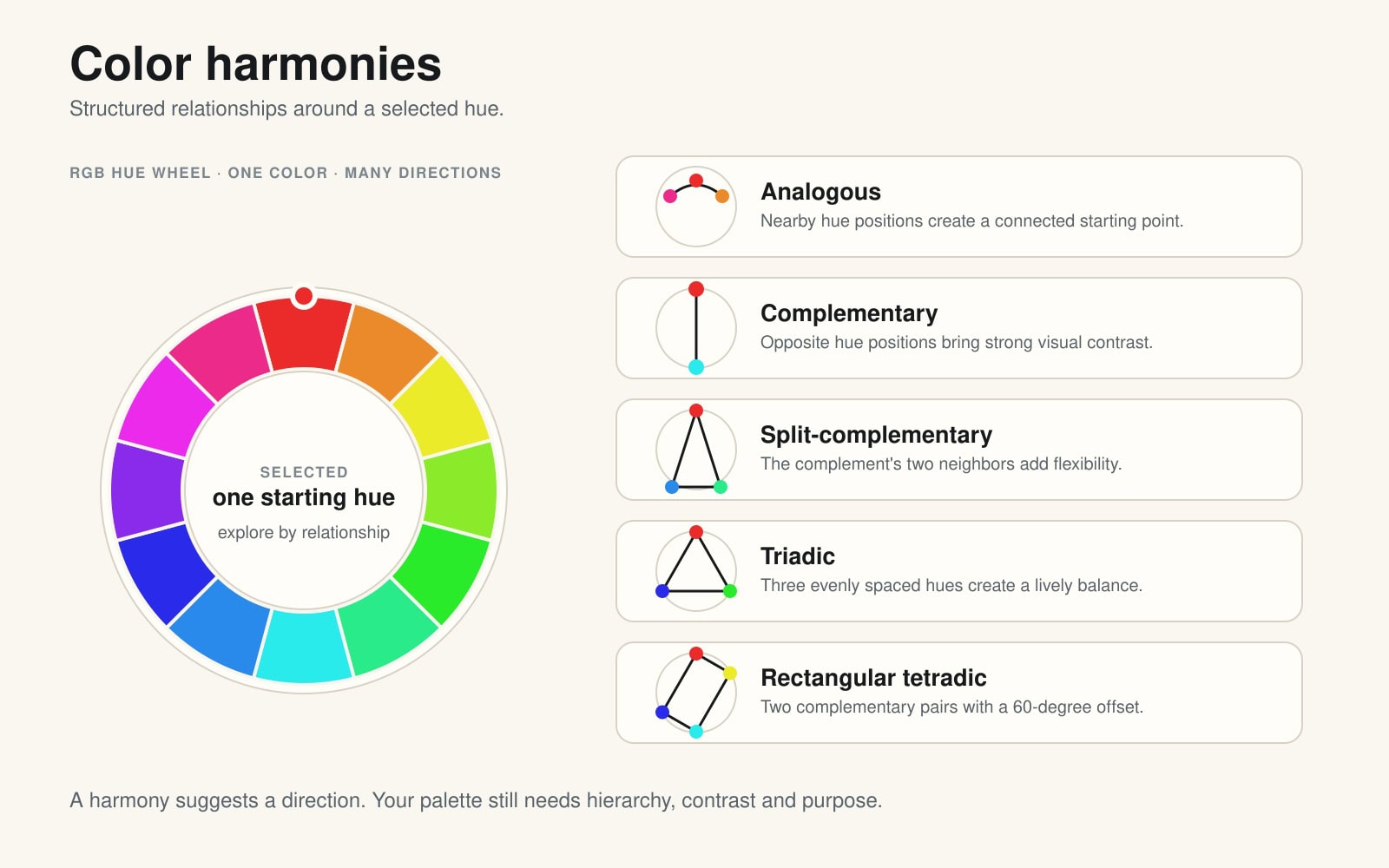
Color harmonies are structured relationships between hues on the color wheel. They are useful when you want a deliberate starting point for a palette, an illustration, an interface or a brand direction.
A harmony does not decide which color should dominate, how much contrast you need or whether the result is accessible. It simply helps you explore a relationship instead of choosing every color in isolation.
Analogous colors
Analogous colors sit close together on the color wheel. Because their hues are neighbors, they usually feel connected and easy to combine.
They are useful for calm interfaces, atmospheric illustrations and palettes that need smooth transitions. The result can become too similar if every color has the same lightness and saturation, so give the colors different jobs: one main tone, one or two supporting tones and enough neutral space.
Complementary colors
Complementary colors sit opposite each other on the color wheel. They create a strong visual difference and can make accents stand out quickly.
That contrast is useful for calls to action, highlights and expressive artwork, but it can become tiring when both colors compete at full strength. In a practical palette, let one color lead and use its complement selectively. Always check the actual foreground and background combination when text or controls are involved.
Split-complementary colors
Split-complementary colors combine one starting hue with the two hues next to its complement. This keeps some of the tension of a complementary pair while giving you more than one direction to work with.
It is a helpful choice when a direct opposite feels too harsh or too limited. Use the starting color as the anchor, then decide which of the two supporting colors should be visible and which should stay quiet.
Triadic colors
Triadic colors are spaced evenly around the color wheel. The relationship creates variety while keeping the group balanced.
Triadic palettes can feel lively and clear, especially in illustration, games and expressive interfaces. They work best when the colors do not all shout at once. Choose a dominant color, assign supporting roles to the other two and use lightness or saturation to control the volume.
Tetradic colors
Tetradic colors form two complementary pairs. They give you a broad palette with plenty of possible contrast and variation.
That flexibility is also the risk: four strong colors can quickly become busy. Start by choosing one dominant pair, then use the second pair for support, accents or special states. A neutral background can give the whole system room to breathe.
A harmony is a starting point
Use a harmony to ask better questions:
- Which color is carrying the main idea?
- Which colors support it?
- Where does the eye need a clear accent?
- Which combinations need a contrast check?
- What should be muted, lighter or darker?
When a direction starts to feel like a real palette, take it into Color Studio and give every color a job.
Explore the color family
Stay close to the color. Change the role, not the identity.
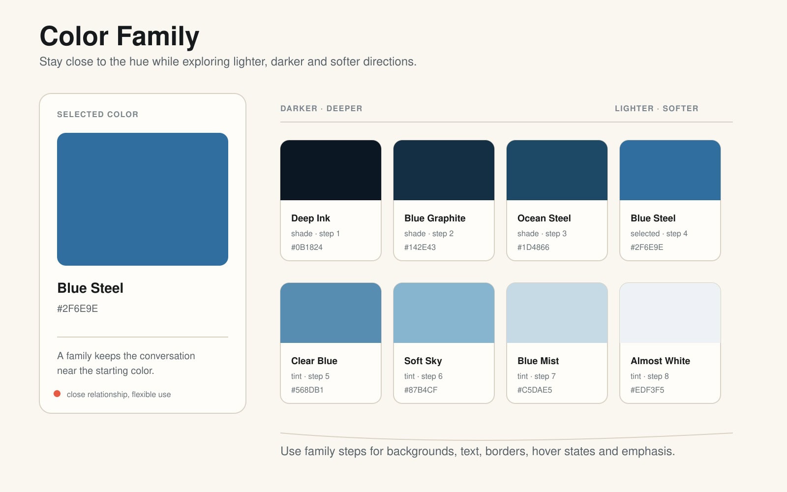
Color Family helps you look around your selected color without jumping to an unrelated hue. It groups nearby variations so you can compare darker, lighter and softer directions while keeping a clear connection to the starting point.
Think of a family as a neighborhood around one color. Shades can add depth, tints can create space and softer tones can reduce visual intensity. The exact result depends on the color model and the direction you explore, but the purpose stays the same: find useful variations that still belong together.
Color Family is useful when you need:
- a darker text or navigation color;
- a lighter page or card background;
- hover and active states;
- borders and subtle separators;
- several illustration shades that feel related;
- a small interface palette built around an existing brand color.
The family is not a replacement for a harmony. A harmony helps you explore a relationship between different areas of the color wheel. A family helps you stay near one selected color and build depth around it.
Start with the selected color, compare the steps, then choose the variants that have a real role in your design. A family can look consistent and still fail contrast checks, so test important text and interface relationships before you use them.
See what happens when colors meet
Color Mixer combines your selected color with a second color and shows the path between them. Instead of looking only at the two endpoints, you can inspect the intermediate shades that appear along the way.
This can help you discover:
- smoother transitions;
- useful mid-tones;
- bridge colors between two parts of a palette;
- unexpected shades for illustration or digital art;
- a more controlled gradient direction.
Choose a mixing model
Color Mixer lets you compare three ways of describing the relationship.
RGB Light
RGB Light treats the colors as light channels: red, green and blue. It is a natural model for screens, interfaces and other work that is ultimately displayed through light.
The result is a channel-based path between the two colors. It is useful when you want to understand how screen colors move from A to B, but it is not a prediction of how physical paint will behave.
CMY Print
CMY Print uses a subtractive, print-oriented idea of color mixing. Cyan, yellow and magenta behave more like inks: they absorb parts of the light rather than adding emitted light together.
Use it as a way to explore print-like transitions and compare them with screen-based RGB results. Real-world ink also depends on paper, pigment and printing conditions, so treat the output as a useful model rather than a physical proof.
RYB Artist
RYB Artist follows the familiar red–yellow–blue painting tradition. It can be a helpful mental model when you are thinking like an illustrator, painter or visual artist.
It is not the only valid color system, and it does not describe every digital or physical mixing process. Its value is practical: it gives you another way to explore what might happen between two colors.
Choose Color B
Color A is your starting point. Color B is the color you want to compare or mix with it.
Complementary B
Color Explorer chooses a partner opposite the selected color on the color wheel. This is a fast way to investigate a high-contrast direction.
Manual B
Choose the second color yourself by entering a value or selecting it in the interface. Use this when you already have a brand color, a reference color or a specific endpoint in mind.
Random B
Color Explorer chooses a second color for you. Random does not mean meaningful or harmonious; it is a discovery tool. It is useful when you want to break out of familiar combinations and see what the mixer reveals.
Read the result as a path
The intermediate colors are not automatically the right choices for a palette. Look for the steps that have a useful role, then test them in a real context. A color that looks interesting in a strip may be too light for text, too weak as an accent or too close to another state.
When the path between A and B starts to suggest a working system, take the colors into Color Studio for semantic roles, realistic previews, contrast tests and exports.

When is Color Explorer useful?
Use Color Explorer when you already have one color and want to understand what could work around it.
It can help you:
- develop a palette from a brand or starting color;
- explore harmonies before choosing a direction;
- find related shades and variations;
- investigate colors for illustration or digital art;
- build supporting colors for web and graphic design;
- discover unexpected blends.
When a direction starts to feel like a real palette, take it into Color Studio and build from there. Or use Live Canvas when you want to see several named relationships together in a website preview.