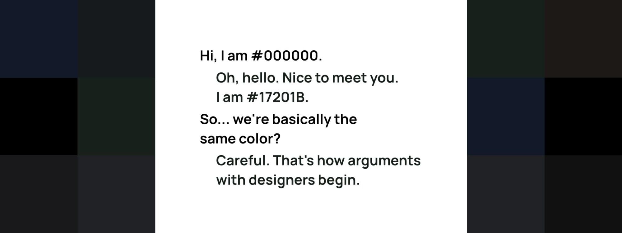
Black text on a white background sounds like the easiest color decision in design.
Choose #000000. Done.
Except there is a surprising amount of room between pure black and something that merely looks black.
A slightly warmer black can make an editorial website feel softer. A blue-black can give a product interface a more technical character. A neutral charcoal can reduce the visual severity of absolute black while still providing extremely strong contrast.
So which black should you actually use on white?
The useful answer is not one perfect HEX code. It is a small family of very dark colors that are all highly readable, but feel subtly different.
Eight black and near-black colors worth trying
All contrast ratios below use a pure white #FFFFFF background.
None of these colors is struggling for contrast.
In fact, every one of them has more than enough contrast for ordinary text on white under the WCAG 2.2 thresholds discussed below.
The interesting choice is therefore less about passing a test and more about what kind of black belongs in your design.
Pure black: #000000
Pure black on white creates the maximum possible WCAG contrast ratio: 21:1.
That makes #000000 wonderfully direct.
It works especially well when the design itself is graphic: strong editorial layouts, large serif headlines, monochrome portfolios, typography-led landing pages or interfaces that deliberately embrace hard black-and-white contrast.
There is nothing inherently wrong with using pure black for body copy either.
But pure black has no hue hiding inside it. That neutrality can make it feel harder and more absolute than a near-black placed in exactly the same layout.
If that crispness supports the design, use it.
If it does not, you have options.
Pure
Black
#000000
Pure Black
This text is Pure Black (#000000).
Contrast on white: 21:1
Character:
sharp, graphic, uncompromising
Good for:
editorial design, bold typography, maximum contrast
Ink black: #111111
#111111 is one of the easiest alternatives to pure black.
The difference looks almost trivial in a color picker. On a large page full of typography, however, it can subtly soften the overall impression.
Its contrast ratio against white is about 18.9:1, so readability is certainly not being sacrificed for delicacy.
This is a particularly useful choice when you want your typography to feel neutral rather than visibly gray.
It still reads as black.
Just not quite absolute black.
Ink
Black
#111111
Ink Black
This text is Ink Black (#111111).
Contrast on white: 18.9:1
Character:
clean, neutral, slightly softer
Good for:
general body text, minimal websites
Qolorio charcoal: #171A1D
#171A1D adds a tiny cool character while remaining visually close to black.
Against white it reaches roughly 17.5:1 contrast.
Qolorio already uses near-black colors in its own interface rather than treating #000000 as the only possible reading color. That same idea works well in design systems: a near-black can function as your primary text color while leaving pure black available for stronger emphasis when you actually need it.
For a general-purpose website, this is a particularly useful starting point.
It feels modern without making its colorfulness obvious.
Qolorio Charcoal
#171A1D
Qolorio Charcoal
This text is Qolorio Charcoal (#171A1D).
Contrast on white: 17.5:1
Character:
balanced, modern, neutral-cool
Good for:
UI, product sites, long-form text
Soft graphite: #18181B
Some near-blacks feel distinctly blue, brown or green.
#18181B is more restrained.
Its tiny shift away from neutral black gives it a contemporary graphite quality while maintaining about 17.7:1 contrast against white.
That makes it easy to place inside interfaces where the typography should support the product rather than become the main visual event.
Think dashboards, portfolio grids, settings screens and productivity tools.
The color is quiet.
The text does not have to be.
Soft Graphite
#18181B
Soft Graphite
This text is Soft Graphite (#18181B).
Contrast on white: 17.7:1
Character:
quiet, contemporary
Good for:
dashboards, portfolios, modern interfaces
Warm black: #1C1917
Black can be warm.
#1C1917 contains a subtle brown undertone that becomes more noticeable when it is placed beside a cooler black.
On its own, most people will simply read it as a beautifully deep dark neutral.
Its contrast against white is approximately 17.5:1.
Warm black can be especially useful when the rest of a palette contains cream, terracotta, muted red, ochre, wood tones or warm photography. Pure neutral black can sometimes feel detached from those colors; a slightly warmer near-black can connect the typography to the palette without turning the text visibly brown.
Small shift. Different atmosphere.
Warm
Black
#1C1917
Warm Black
This text is Warm Black (#1C1917).
Contrast on white: 17.7:1
Character:
subtly warm, editorial
Good for:
lifestyle, interiors, food, premium brands
Midnight black: #111827
If your palette already leans toward blue, try moving black in the same direction.
#111827 is a deep blue-black with about 17.7:1 contrast on white.
It works naturally with cool grays, blues, cyan accents and the kinds of bright interface colors commonly used in technology products.
This does not mean every technology company needs blue-black text.
It simply demonstrates a useful principle:
Your darkest neutral can belong to the palette too.
Black does not have to sit outside the color system.
Midnight Black
#111827
Midnight Black
This text is Midnight Black (#111827).
Contrast on white: 17.7:1
Character:
cool, slightly blue
Good for:
technology, SaaS, data and product design
Forest black: #17201B
The same trick works with green.
#17201B is dark enough to appear almost black in normal text, but contains a restrained green undertone. Its contrast against white remains very strong at roughly 16.7:1.
That makes it an interesting alternative for botanical, wellness, outdoor, food or sustainability-oriented design systems.
Be subtle with colors like this.
If you push the green too far, you no longer have a near-black; you simply have dark green text. That can still be perfectly good design, but it becomes a different decision.
Near-black works because its personality whispers.
Forest Black
#17201B
Forest Black
This text is Forest Black (#17201B).
Contrast on white: 16.7:1
Character:
organic, green-toned
Good for:
nature, wellness, sustainable brands
Cool graphite: #202124
At #202124, the difference from absolute black becomes easier to notice while the color still remains extremely dark.
Contrast against white is around 16.1:1.
That leaves an enormous readability margin while giving the page a calmer neutral than #000000.
It is a useful direction for applications, documentation, productivity software and information-heavy interfaces.
This is also a good reminder that moving away from black does not mean moving anywhere near low contrast.
There is a lot of room down here.
Cool Graphite
#202124
Cool Graphite
This text is Cool Graphite (#202124).
Contrast on white: 16.1:1
Character:
restrained, practical
Good for:
apps, tools, productivity interfaces
What WCAG actually says about black text
The Web Content Accessibility Guidelines, or WCAG, are accessibility guidelines published by the W3C.
For ordinary text, WCAG 2.2 Level AA requires at least 4.5:1 contrast between the text and its background. Large-scale text has a minimum of 3:1. The stricter Level AAA criterion raises those values to 7:1 for ordinary text and 4.5:1 for large-scale text.
Notice how far our eight colors sit above those thresholds.
Even the lightest color in this selection, #202124, is above 16:1 on white.
That does not mean a website using it is automatically “WCAG AAA compliant.” Accessibility conformance covers far more than one text color.
It means something narrower and more useful:
this particular text-and-background pair has a very large contrast margin.
That margin is valuable because real interfaces are messier than color swatches.
The most contrast is not automatically the best design
If contrast were the only design consideration, this article could have ended at #000000.
But we do not design contrast ratios.
We design interfaces, pages and reading experiences.
A black with a tiny blue undertone may sit more naturally beside a cool product palette. A warm near-black may make cream photography and earthy colors feel more coherent. A neutral charcoal can give you an almost invisible degree of softness.
Beauty is subjective here.
Readability is not entirely subjective, but it is not determined by color alone either.
Typeface, font size, weight, letterforms, line spacing and line length still affect the reading experience. WCAG itself notes that thin or unusual fonts can render more faintly because of anti-aliasing, even when the underlying CSS color has sufficient mathematical contrast.
Qolorio explores this in Your font changes how text color works. The same contrast ratio can feel remarkably different when the letters themselves change.
Color gets the text onto the stage.
Typography still has to perform.
Should body text and headings use the same black?
They can.
They do not have to.
A restrained design might use #171A1D for almost everything and create hierarchy through size, weight and spacing alone.
Another system might use #111111 for headings, #202124 for body copy and a lighter gray for genuinely secondary information.
Neither approach is automatically better.
The danger starts when “secondary” slowly becomes “barely visible.”
The existing Qolorio guide The best text color for a website? Not always black explores that broader hierarchy of text colors in more detail. It already shows how dark gray and near-black can remain comfortably readable on white.
For any final pair, the Qolorio Color Contrast Checker is the faster way to test the exact foreground and background you intend to use.
How to choose between these blacks
Start with the rest of the palette.
If your interface is aggressively minimal and graphic, #000000 may be exactly right.
For a neutral all-rounder, try #111111, #171A1D or #18181B.
If your palette is warm, compare #1C1917.
For cooler digital palettes, test #111827 or #202124.
For earthy greens and natural colors, #17201B can make the typography feel more integrated.
Then stop looking at isolated color chips.
Put the color into a real paragraph. Add headings, links, buttons, labels and form controls. Look at the design on the devices people will actually use.
A difference of a few RGB values may be almost invisible as one letter.
Across an entire interface, it can quietly change the mood.
So what is the best black on white?
For maximum contrast, the answer is simple:
#000000 on #FFFFFF.
For design, there is no single winner.
If you want a versatile starting point, #171A1D is an excellent near-black: extremely high contrast, neutral enough for long-form reading and just soft enough to feel different from absolute black.
But warm black, blue-black and graphite can all be equally readable while giving the palette a different voice.
Choose the darkest neutral that belongs to the rest of your design.
Then test it as text, not just as a swatch.
Black is not one color. Up close, it is a palette.