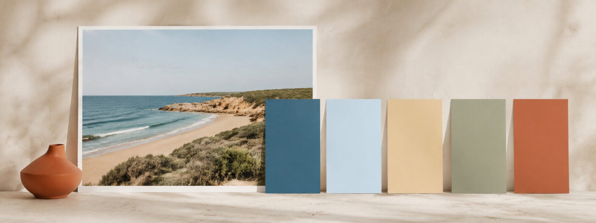
Sometimes the colors you need are already right in front of you.
You may have a wedding photograph with soft sage leaves, warm skin tones and an old stone wall. A holiday photo with deep sea blue, sun-faded terracotta and bright white buildings. Or a game environment whose foggy greens and glowing orange lights already have exactly the atmosphere you want.
You could open a color picker and choose something vaguely similar.
Or you could let the image itself become the starting point.
Creating a color palette from an image gives you colors that already share a visual context. Instead of asking, “Which blue looks nice?”, you can ask a much more useful question:
Which colors make this particular image feel the way it does?
That palette can then guide a website, app, photo book, game interface, presentation, brand, illustration or almost anything else that needs a coherent visual direction.
What is a color palette from an image?
An image contains far more colors than you probably want in a palette.
Even a photograph that looks mostly blue may contain thousands of slightly different blues because of shadows, reflections, compression, texture and light. Color extraction tools simplify all of that information into a smaller group of representative colors.
The simplest approach is to look for colors that appear frequently. These are often called dominant colors.
But dominant does not always mean important.
Imagine a photograph of someone in a red coat standing against a large gray concrete wall. Most of the pixels may be gray, so an automatic tool could reasonably decide that several gray shades are important. Your eye, however, might immediately decide that the small red coat is the color the whole design should revolve around.
That is why creating a useful palette is not just extraction.
The image provides the evidence. You provide the intention.
Why create a palette from an image at all?
Starting from an image is useful when the image already contains part of the visual identity of your project.
A wedding photographer, for example, might build a photo-book palette around the actual flowers, clothing and surroundings in the photographs. Page backgrounds, titles and small decorative elements can then support the photography rather than introducing unrelated colors.
The same idea works for travel photography. A book about a Greek island might draw its palette from white walls, deep blue water, faded shutters and warm stone instead of using a generic “Mediterranean blue” from a color picker.
For a website, you might extract colors from the main hero photograph and use them to guide backgrounds, cards, buttons and accents.
For a game, the environment itself can inspire the interface. A forest scene might provide several muted greens and browns, while one small magical light provides an accent color for important actions.
An app based around a particular collection of photographs, products or artworks can use the same approach. Rather than designing the interface independently and hoping the content fits, the interface can grow from the content.
Other useful starting points include:
- album artwork, film stills and posters;
- product photography and packaging;
- paintings, illustrations and textile patterns;
- interiors, architecture and landscape photography;
- fashion collections and mood boards;
- presentation themes and social templates;
- maps, aerial photography and nature studies;
- existing brand photography;
- screenshots from an older product you are redesigning;
- a collection of reference images for a creative project.
The goal is not necessarily to make the final design look exactly like the photograph.
It is to create a relationship between them.

How to create a color palette from an image
There is no single correct palette hidden inside a photograph waiting to be discovered.
The same image may support a quiet palette, a vivid palette, a dark interface or a warm editorial design. A good workflow therefore combines automatic extraction with a little human judgment.
1. Start with an image that represents the direction you want
A technically beautiful photograph is not automatically a useful color reference.
Ask why you chose it.
Is it the warm evening light? The faded colors? One particularly strong blue? The combination of natural greens and stone? The contrast between a dark scene and one bright detail?
Knowing what attracted you to the image makes the next decisions much easier.
If you are working from several images – perhaps a holiday album or a product collection – look for recurring characteristics rather than trying to include every color from every photograph.
You are looking for a visual language, not conducting a pixel census.
2. Decide what the palette needs to do
Before extracting twenty beautiful colors, consider where they are going.
A photo-book spread may need a restrained background, a text color and two or three supporting accents.
An illustration may benefit from many related colors.
A website or app needs colors that can take on practical jobs such as page background, text, buttons, borders, selected states, warnings and success messages.
A game might need both environmental colors and interface colors that remain readable over complex scenes.
The intended use helps determine how many colors you need and how much variation is useful.
More colors do not automatically make a better palette. They simply give you more decisions to make.
3. Let automatic extraction show you the obvious colors
Automatic analysis is a good first pass because it can quickly reveal the main color structure of an image.
In the Qolorio Image Color Picker, you can upload a photograph, illustration or screenshot and let Qolorio analyze it. Dominant looks for colors that appear strongly in the image, while alternatives such as Vibrant, Muted, Dark, Light, Warm and Cool let you explore different interpretations.
That distinction matters.
Suppose your photograph contains pale sand, a large blue sky, dark rocks and three vivid orange umbrellas. A dominant palette may emphasize the sand and sky because they occupy most of the image. A vibrant interpretation can tell a different story by giving those orange umbrellas more attention.
Neither version is inherently more correct.
They answer different questions.
The same image can tell more than one color story.
4. Pick important colors manually
Automatic extraction looks for patterns. You can look for meaning.
If one tiny object matters to the project, sample it directly.
Perhaps it is the exact blue of a bride’s bouquet ribbon. The yellow lettering on an old shop sign. A characteristic green in a product photograph. A glowing object in a game scene. Or a painted detail that appears only in a small part of an illustration.
Qolorio lets you place and move sample points directly on an image, so automatic and manual extraction can be combined.
That is often better than choosing one method exclusively.
Let the algorithm find what is visually common.
Then tell it what is creatively important.
5. Keep the good discoveries and explore around them
You do not need to start over every time one color feels wrong.
When you find a color that clearly belongs in the palette, lock it. In Qolorio, locked samples stay in place while you continue analyzing the remaining colors.
This gives palette creation a much more natural rhythm.
Find one keeper.
Explore the rest.
Keep another.
Try a different direction.
A palette can develop gradually rather than appearing perfectly finished in one click.
6. Refine the extracted colors
An extracted color is not sacred just because it came from the original photograph.
You may discover that a beautiful dusty green becomes too weak when used for small text. A nearly white cream may disappear on the page background. Two browns that looked distinct in the photograph may feel almost identical when reduced to flat swatches.
Edit them.
You can make a color slightly lighter, darker or less saturated while keeping its connection with the image.
This is especially important because photographs contain lighting, texture and surrounding detail. A flat UI button made from a sampled color does not have those same visual conditions.
Sample from reality. Design for the place where the color will actually live.
Dominant colors are not the same as a good palette
This is one of the most important things to understand about image-based palettes.
Automatic extraction can tell you a great deal about an image. It cannot know everything about your project.
A dominant palette from a snowy mountain photograph might contain mostly whites, grays and pale blues. That may describe the photograph beautifully.
It may not provide an obvious call-to-action color for a travel website.
A photograph of a dark concert venue may produce wonderfully atmospheric blacks, violets and deep reds. They could make a striking album cover while creating difficult text relationships in an interface.
So treat extraction as observation rather than instruction.
You are allowed to keep four colors from the image and introduce a fifth.
You are allowed to adjust a sampled color.
You are allowed to ignore the most common color completely.
A palette should remain connected to the source without becoming trapped by it.
Turn image colors into actual design roles
Once you like the colors, the more interesting question begins:
What should each color do?
For a simple photo book, that might be obvious. One warm cream becomes the page background, charcoal handles text and two colors from the photographs become small decorative accents.
Interfaces are more demanding.
A website or app may need a foundation color, readable text, secondary text, surfaces, borders, actions, selected states and feedback colors. Color Studio is designed for this next stage: you can bring an image-derived palette into Studio, assign semantic roles and see the colors in realistic previews.
“Semantic role” sounds technical, but the idea is simple.
Instead of thinking only in color names such as dark green and warm yellow, you start thinking in jobs such as page background, body text, primary action and warning.
That makes a palette reusable.
If you later decide that the yellow should become the primary action instead of the green, the job stays understandable even though the color changes.
For many Studio projects, a compact palette is enough. Qolorio suggests that around eight to ten colors can be a useful starting point when a design needs room for backgrounds, text, actions, accents and feedback, although smaller systems can work perfectly well too.
Open Color Studio when you want to turn the palette into a working color system rather than stopping at the swatches.
When Qolorio’s Color Palette Generator makes more sense
Not every project needs interface roles.
Perhaps you are creating an illustration with 48 colors. A game world with terrain, characters and objects. A large artistic color study. A map palette. A collection for Procreate. Or you simply want to explore many variations from an image before deciding what to use.
That is where Qolorio’s Color Palette Generator is the better fit.
Color Palette Generator focuses on the palette itself and supports palettes from 2 to 256 colors. You can use image extraction alongside other starting points such as your own colors, harmonies, moods and exploratory generation.
It can also export palettes into formats intended for different creative and development workflows, including formats for Adobe applications, Procreate, Affinity, Krita, GIMP, Inkscape, Canva, Figma and web or developer use.
Think of the distinction this way:
Image Color Picker finds and refines colors.
Color Palette Generator explores the palette.
Studio gives the colors jobs.
You may use only one of them.
Or move from one to another as the project grows.
Test image-derived palettes in their real context
A palette can look wonderful as five rectangles and fail immediately when used.
That is normal.
An extracted beige might look elegant beside the other swatches but provide poor contrast with white text. Two lovely muted greens may be difficult to tell apart when they represent different chart categories. A dark-blue interface may look beautifully cinematic until buttons and form boundaries begin disappearing into it.
This is why accessibility belongs inside the palette workflow.
The Web Content Accessibility Guidelines, usually shortened to WCAG, are international accessibility guidelines developed through W3C. For normal-sized text, WCAG 2.2 Level AA generally requires a contrast ratio of at least 4.5:1 between text and its background; large text has a lower 3:1 threshold. Those numbers describe luminance contrast – essentially the measurable light–dark relationship between two colors – not whether a palette is attractive or whether an entire design is accessible.
Use the Qolorio Color Contrast Checker to test the pairs that actually touch each other.
And remember that passing a contrast calculation is only one piece of accessibility.
Color should also not be the only way important information is communicated. A red error field, for example, is stronger when it also has an icon or clear error message. A green and red chart becomes more robust when its series can also be distinguished by labels, shapes or patterns.
If several palette colors need to remain distinguishable, the Color Vision & Palette Checker can help you investigate them under different color-vision simulations.
A simulation is useful evidence.
It is not a medical diagnosis, and it does not prove that the complete design is accessible.
Remember that photographs and final colors live in different worlds
The color you sample is a numerical color value, but the way it appears can still change.
Screens differ. Brightness differs. Color profiles differ. Ambient light differs. Printed paper behaves differently from a glowing display.
That matters particularly for projects such as wedding albums, photography books, packaging and printed artwork.
An image-derived palette can provide an excellent visual direction, but important printed colors should still be checked in the actual print workflow. Professional printing may involve printer profiles, paper choices and physical proofs that a browser preview cannot reproduce completely.
For digital work, test on the kinds of screens and layouts where people will actually see the design.
A palette is not finished when its HEX codes look convincing.
It is finished when the colors work where you need them.
Your image can stay on your device
Photographs can be personal.
A wedding photograph, family picture, unpublished artwork or client screenshot may be something you would rather not upload to an external service merely to inspect its colors.
Qolorio’s current image color extraction runs locally in your browser. The selected image is analyzed on your device rather than uploaded to Qolorio for the color extraction itself.
That means you can explore the colors of private or work-in-progress imagery without sending the image to Qolorio just to create the palette.
It is a small technical detail with a rather practical consequence.
Your image. Your device. Your colors.
From photograph to palette to project
Creating a color palette from an image is not really about copying colors.
It is about noticing relationships that already work, deciding which of them matter and carrying that visual logic into something new.
Start with automatic extraction when you want to see the image’s strongest patterns. Sample manually when a small but meaningful color deserves a place. Keep the colors that work, refine the ones that almost work and test the final palette in its real context.
Use the Image Color Picker when you want to extract and inspect colors directly from an image. Move to Qolorio’s Color Palette Generator when you want deeper palette exploration or a much larger set. Continue in Color Studio when those colors need to become a practical system for a website, app, game or other structured design.
Because sometimes the right color is not waiting in a mixer.
It is already hiding in the photograph.
Find the colors. Then decide what they are for.