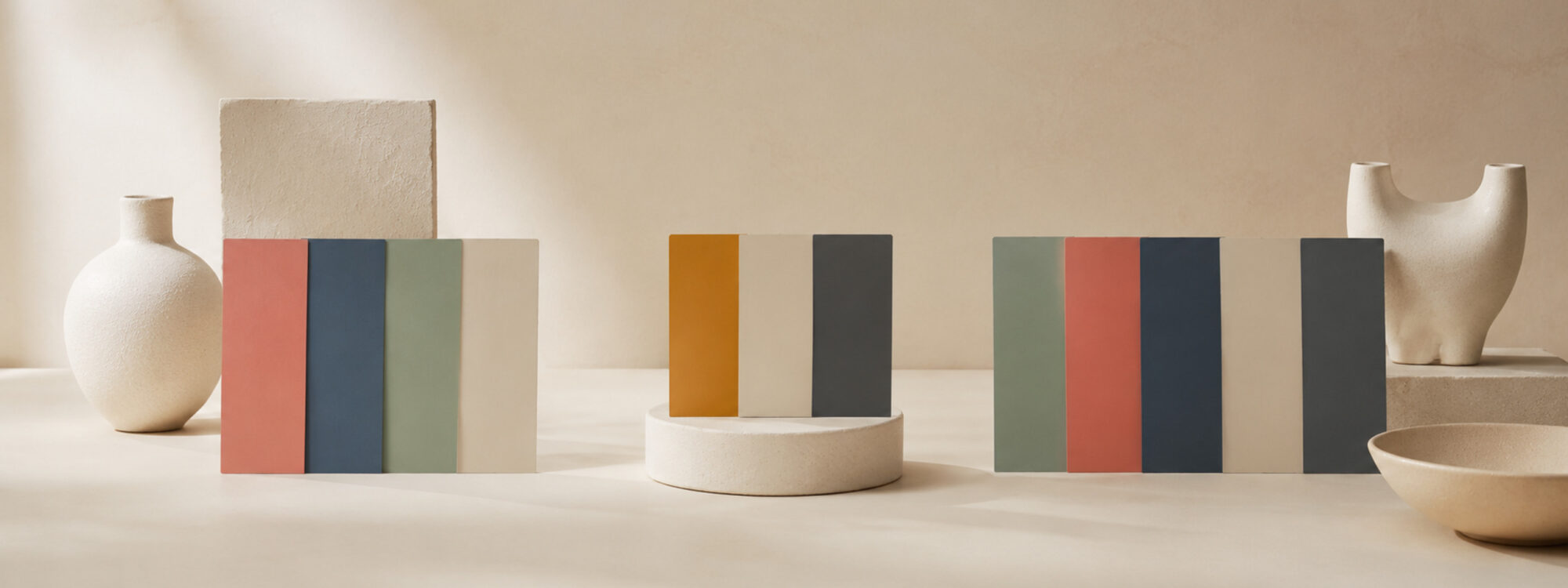
You start with a background.
Then a text color.
Then the brand color needs a darker version for hover. The form needs red for errors. Success needs green. Cards need a slightly different background. Borders appear. Someone adds a second accent.
Suddenly your neat three-color website has twelve swatches.
Is that too many?
Usually, no.
For many simple websites, around 5–8 core interface colors is often enough, while very small landing pages may need fewer. A website with more interface states may be more comfortable with 8–10, while complex apps, dashboards and data-heavy products can need considerably more.
But there is a catch.
Before counting colors, you need to decide what counts as one.
First: what does “number of colors” actually mean?
Imagine a website that uses blue buttons.
The normal button is blue. The hover state is darker blue. A pale blue appears behind selected items. Links use another blue. The focus state has a stronger version.
Is that one color because everything is blue?
Or five colors because there are five different values?
Both answers can make sense.
It helps to separate three ideas.
A hue family is the broad color direction: blue, red, orange, green.
A color value is one exact color, such as #28618F.
A color role describes the job a color performs: page background, text, border, primary action, error or success.
Design systems often encode these roles as semantic design tokens. Instead of remembering that #171A1D is used for text, the code can simply call it something like text.
That distinction changes the question completely.
A website may use only one obvious brand hue while containing ten or twenty actual color values.
And a photography portfolio may display thousands of colors on screen while its interface itself uses only white, near-black and one accent.
Count the system, not every pixel.
So how many colors should a website use?
If you want a practical starting point rather than a philosophical answer:
Start with about eight core interface colors.
You may end up using fewer.
You may need more.
Eight simply gives you enough room to create a useful hierarchy without beginning with an unnecessarily complicated palette.
A small website might use colors for:
- page background;
- surface or card background;
- main text;
- secondary text;
- borders;
- primary action or accent;
- a darker or lighter action state;
- one or more feedback states when required.
That is already much more realistic than “pick three nice colors”.
It is also close to how Qolorio Color Studio approaches palette building: for many projects, eight to ten colors is a strong starting point. Smaller palettes work when several roles can sensibly share the same color.
The important word there is roles.
You are not trying to collect eight attractive swatches.
You are trying to give the design enough colors to do its work.
Three colors can be enough – for the right website
A three-color palette is not wrong.
Consider a very small landing page with:
- a light background;
- dark text;
- one blue accent.
That may be all it needs visually.
The accent can handle links and the main button. The text color can handle headings and paragraphs. The background stays quiet.
Done.
This is one reason very minimal websites can feel so confident. There is almost nothing competing for attention.
Berkshire Hathaway’s famously restrained homepage is an extreme example of this philosophy. It is essentially a document full of information and links rather than a modern application with cards, tabs, filters, notifications and dozens of interactive states.
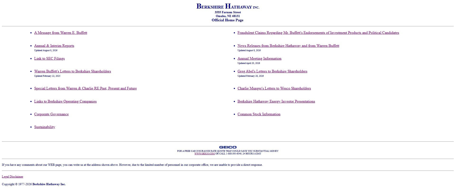
The fewer jobs your interface has, the fewer colors it needs.
But the moment that simple page gains forms, account states, alerts, secondary buttons, selected navigation, cards and interactive feedback, three colors may stop being convenient.
You could force every new job into those same three colors.
That does not necessarily make the design simpler.
Sometimes it just makes different things look suspiciously similar.
The 60–30–10 rule does not mean websites may only use three colors
You may have seen the 60–30–10 rule.
It is a useful visual composition idea: let one color dominate roughly 60% of a design, a supporting color occupy about 30%, and an accent take the remaining 10%.
Do not treat those percentages as mathematics your browser must obey.
And do not confuse them with a three-color limit.
A mostly white website could devote most of its visual area to a neutral background, use dark surfaces and typography as its supporting visual mass, and reserve blue for small accents – while still having separate values for borders, muted text, hover states, errors and focus indicators.
The rule is about visual weight.
Not the number of hexadecimal codes in your stylesheet.
Practical starting ranges for different kinds of websites
There is no industry standard that says a blog needs exactly six colors or an online shop needs nine.
The following are better treated as useful working ranges than rules.
| Type of website | Practical starting range | Why |
|---|---|---|
| Simple landing page or personal site | 4–6 | Few components and little state |
| Blog or editorial site | 5–7 | Reading dominates; hierarchy can stay restrained |
| Business or marketing website | 5–8 | More sections, actions and branded elements |
| Ecommerce website | 7–10 | Products, prices, promotions, stock and transactional states add jobs |
| SaaS product or web app | 8–14+ | Inputs, navigation, actions, states and feedback require clearer distinctions |
| Dashboard or data-heavy interface | 10+ | Interface colors and data colors often need to be managed separately |
| Portfolio, game or color tool | As many as the content needs | Color itself may be part of the experience |
The last row matters.
A website about color does not become badly designed simply because there are a lot of colors on the screen.
The interface still needs a hierarchy.
The content is allowed to have a party.
How other design systems handle color
Large design systems rarely work by choosing five arbitrary swatches and using them everywhere.
They start with a smaller foundation and turn those colors into roles.
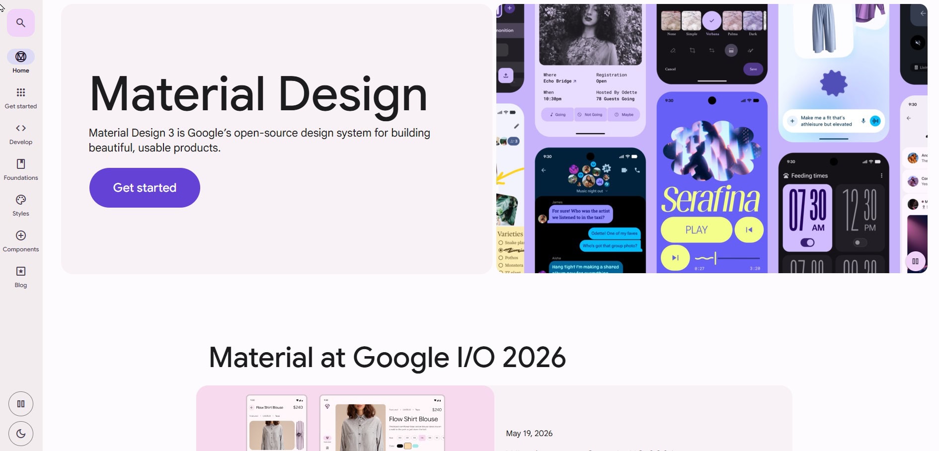
Google’s Material 3 system, for example, starts with key colors such as primary, secondary and tertiary, then expands them into a much larger set of semantic roles for surfaces, containers, content, outlines, errors and interface states.
So a Material interface can contain more than twenty color-related theme attributes without looking like twenty unrelated colors were thrown at it.
GOV.UK offers another useful example.
Its visual identity is strongly anchored by blue, with teal as a core accent. Yet the underlying design system includes separate functional colors for text, links, borders, backgrounds, focus, errors and success, plus tints and shades in its broader web palette.
Visually restrained.
Structurally much richer.
That is often what a good website color system looks like.

What about very colorful websites?
Now move in the other direction.
A marketing site such as Stripe can combine interface colors with gradients, illustrations, product screens, photography and colorful content.

Trying to count every visible color would not tell you much about the quality of its interface.
The better question is whether the important interface elements remain predictable.
Does the same kind of button look like the same kind of button?
Are links recognizable?
Do important actions stand out?
Can people tell an error from an ordinary decorative accent?
A site can contain fifty visible hues and still feel controlled.
Another can contain six and feel chaotic.
Color count is not the same thing as color discipline.
Qolorio is a useful edge case
Qolorio is an unusually good website for testing this question because displaying lots of colors is part of the product.
The palette library contains huge numbers of color values. Studio previews can deliberately show entirely different palettes. Color tools need to display whatever colors a visitor chooses.
Counting all of those would produce a spectacularly large number.
It would also answer the wrong question.
Looking instead at Qolorio’s main interface layer, the core design tokens define separate roles for backgrounds, surfaces, text, borders, accents, feedback states and focus. Several roles deliberately share the same value, so the system contains more semantic jobs than literal core colors.
Those roles cover things such as backgrounds, surfaces, text, muted text, borders, accent colors, success, warning, danger and focus.
Some roles deliberately share a value.
For example, one actual color can serve both an accent and an informational role. Another pale color can work both as a stronger surface and as a soft accent background.
That gives Qolorio more jobs than literal core colors.
The rest of the plugin naturally contains additional colors for specialized tools, previews and fallbacks.
And then there are all the palettes themselves.
Those are content.
Counting them as part of Qolorio’s interface palette would be a little like counting every color in every photograph on Instagram and calling the result Instagram’s brand palette.
More colors are useful when they create real distinctions
Adding another color is reasonable when it solves a problem.
Perhaps your product needs separate success, warning and error states.
Perhaps a dashboard needs several data series.
Perhaps different categories genuinely benefit from their own identity.
Perhaps dark mode needs another set of values.
Perhaps your primary brand color does not work as a readable button background, so you need a darker version.
Good.
Add the color.
A larger palette becomes troublesome when colors appear without a reason.
Different sections get random background colors.
Three buttons with the same importance are three different hues.
Every card receives its own accent.
Status red is also used decoratively all over the homepage.
One-off hex codes appear whenever somebody wants something “a bit different”.
At that point, the problem is not that the website crossed some magical numerical limit.
The problem is that the system has stopped explaining itself.
Add a color when it creates a useful distinction.
Fewer colors can make hierarchy easier
Restrained palettes have a practical advantage.
Attention becomes easier to control.
If almost everything is neutral and only one important action is blue, that blue has enormous visual power.
Introduce pink buttons, orange links, green headings, purple icons and yellow cards, and the blue must suddenly compete for attention.
This is especially useful to remember with highly saturated colors.
As explored in Qolorio’s Color Meanings: What Colors Can Communicate, vivid color tends to speak loudly. Several loud colors can coexist, but they need hierarchy and enough quieter space around them.
If everything is an accent, nothing is.
Accessibility does not set a maximum number of colors
WCAG stands for Web Content Accessibility Guidelines. These are accessibility guidelines developed through the W3C to help make websites and other digital content usable by more people.
WCAG does not tell you that a website may contain five, eight or twenty colors.
It asks different questions.
For ordinary text, WCAG 2.2 level AA generally requires a contrast ratio of at least 4.5:1 between the text and its background. Large-scale text generally needs at least 3:1. Important non-text interface cues and graphical objects generally need 3:1 against adjacent colors when they are required to identify a component, state or meaning.
And color should not be the only visual way important information is communicated.
So accessibility is not an argument for making every website gray.
It is an argument for making the relationships between your colors work.
Qolorio’s Color Contrast Checker can test the foreground and background combinations you actually intend to use.
If several colors need to remain distinguishable from one another — in charts, states, labels or controls — the Color Vision & Palette Checker can help you inspect how those distinctions behave across common color-vision simulations.
And Color should help, not do all the talking goes deeper into why an error, status or category should not depend on color alone.
More colors simply mean more relationships to think about.
Eight colors can form 28 different pairs.
Fourteen can form 91.
You do not need to test every possible pair if most of them never meet in the interface. But as a palette grows, accidental combinations become easier to create.
That is another good reason not to add colors casually.
Do neutrals count?
Yes.
Please count them.
White, cream, near-black, gray text, pale card backgrounds and subtle borders may not be the exciting part of a palette, but they often occupy most of the interface.
A website described as “blue and orange” might actually rely on:
- white for the page;
- off-white for cards;
- near-black for body text;
- gray for secondary text;
- light gray for borders;
- blue for actions;
- dark blue for hover;
- orange for accents.
That is already eight colors.
Only two of them sound colorful when somebody describes the brand.
The neutrals are doing most of the work.
Do shades of the same color count separately?
When you are building the actual interface: usually, yes.
A primary blue and its darker hover version are two different color values.
But they still belong to one visual family.
This is why saying “our website uses blue” and saying “our design system contains six blues” can both be true.
The first describes the visual identity.
The second describes the implementation.
Do not get too attached to the number itself.
What matters is whether those six blues have understandable relationships and useful jobs.
How do you know when you have enough colors?
Try removing one.
If nothing meaningful changes, you may not need it.
If removing it makes two important states impossible to distinguish, that color was earning its place.
Then inspect the palette by role.
Can you identify the background?
Main text?
Secondary text?
Surface?
Border?
Primary action?
Focus state?
Success, warning and error where they exist?
Can someone understand those states without depending on color alone?
Do the foreground and background combinations have enough contrast?
And perhaps the simplest test:
Can you explain why every core color exists?
If you can, a palette of twelve may be beautifully disciplined.
If you cannot, a palette of five may already contain one color too many.
Start small, then let the website earn more color
So, how many colors should a website use?
For a simple site, 5–8 core interface colors is a useful range.
For a website with more interactive states, 8–10 is a strong place to begin.
Complex products may comfortably need 10, 14 or many more values, especially once status colors, data visualization, themes and component states enter the picture.
Start with the colors required for the foundation.
Give each one a job.
Use Color Studio to see how those colors behave as backgrounds, surfaces, text, actions and states rather than judging the palette only as a row of attractive swatches.
Then add another color when the design gives you a reason.
Not because an article told you that websites are supposed to have seven.
Use as many colors as the design needs — and no more than you can explain.
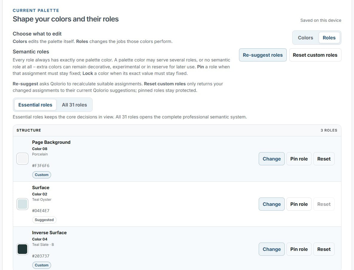
Want to see a compact role system in use? Open Live Canvas to preview ten essential website color roles before expanding the work in Color Studio.