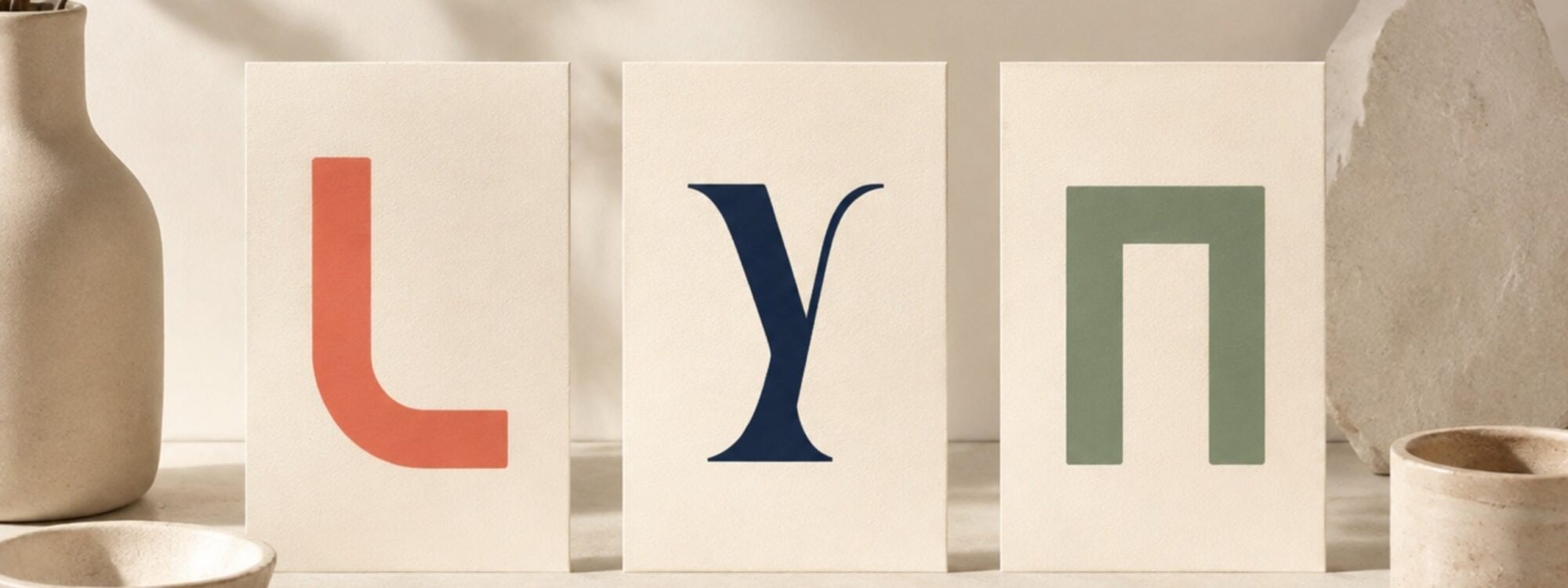
A text color can have excellent contrast and still be surprisingly hard to read.
Because we do not read contrast ratios.
We read letters.
And the size, weight and shape of those letters change how clearly a text color actually works.
Contrast measures the colors
A contrast checker compares a foreground color with the background behind it. For example, dark text on white might produce a contrast ratio of 9:1. That number stays the same whether the text is regular, bold, light, thin, large, small, wide or narrow.
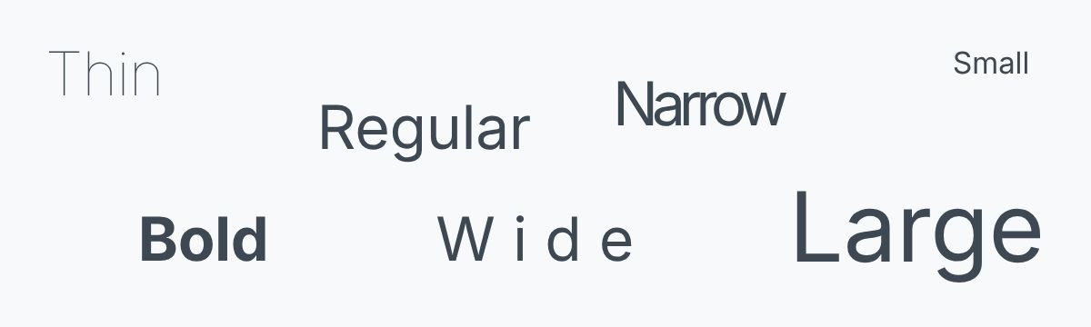
The colors have not changed. But the reading experience certainly can.
Same colors. Different letters. Different reading experience.
If you want the basics first, The best text color for a website? Not always black explains how text and background colors create a contrast ratio together.
Typography changes what your eyes have to recognize
Compare a large, sturdy heading with tiny extra-light text. The same dark gray may look strong and obvious in the heading while the thin text feels much more delicate.
Several things contribute:
Font size
Larger characters are generally easier to distinguish.
Font weight
Very thin strokes give the text less visual presence.
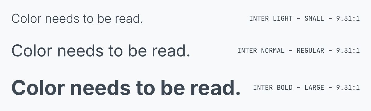
Spacing
Letters, words and lines also need enough room to be read comfortably.
None of these changes the mathematical contrast ratio between the text color and its background.
They change what you are asking someone to read.
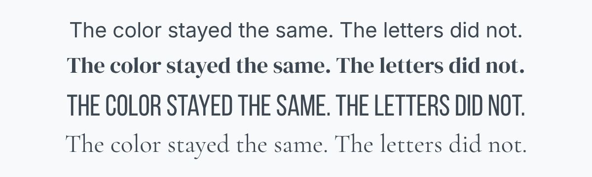
Typeface
Some letterforms are simpler and more familiar than others. Decorative, condensed or unusual forms may require more effort to recognize.
Where does WCAG 2.2 come in?
WCAG stands for Web Content Accessibility Guidelines: an international accessibility standard for websites and other digital content.
For ordinary text, WCAG 2.2 Level AA requires a contrast ratio of at least 4.5:1.
For large-scale text, the minimum is lower at 3:1, because larger letterforms can generally be distinguished more easily. WCAG defines large-scale text as at least 18pt when regular or 14pt when bold – roughly 24px and 18.7px in CSS.
WCAG also specifically notes that unusually thin strokes or unfamiliar letterforms can be harder to read, particularly at lower contrast levels.
That last point matters.
A passing contrast ratio is a minimum requirement for the color pair.
It is not a promise that every typographic treatment using those colors will feel equally readable.
Large text gets more room – not a free pass
The lower 3:1 threshold for large text can be useful for headings and display typography. But do not assume something qualifies just because WordPress calls it a heading.
An H3 can still be small.
A heading can also be large but unusually thin.
And a font size that looks substantial on your laptop may feel very different on another screen.
When there is no good reason to push text toward the minimum, a little extra contrast gives the design more room.
Color and typography can build hierarchy together
Not every text role has to look the same.
A design may use:
- strong near-black for body text;
- a dark blue for headings;
- slightly softer text for supporting information;
- bold text for important labels;
- larger type for section titles.
That creates hierarchy without simply making every less-important element pale gray.
This is particularly useful for secondary and muted text.
Making text quieter is fine. Making it difficult to read is not.
Small text deserves extra care
Tiny labels, metadata, form hints and captions are often where otherwise thoughtful designs become unnecessarily difficult.
They are made smaller because they are secondary.
Then they are made lighter because they are secondary.
Then someone makes the font weight thinner because that looks elegant.
Each decision makes sense on its own.
Together, they can leave very little text behind.
If something needs to be read, give it enough visual presence to do that job.
Test the combination, not just the swatch
This is why typography is best judged in context.
Do not only look at:
Aa
Try the actual typeface.
At the actual size.
At the actual weight.
Against the actual background.
And then put a real sentence or paragraph in it.
A single beautifully kerned word can hide problems that become obvious after three lines of text.
In Color Studio, you can take your colors into the Preview stage and see them behaving as actual text, headings and interface elements. Try different font styles alongside the colors rather than deciding on each separately.
The Color Contrast Checker can tell you whether the color pair has enough contrast.
The preview helps answer the next question:
Does this combination actually feel good to read?
Contrast gives the letters enough separation. Typography still has to make them worth reading.
Live Canvas lets you compare readable type styles with a compact website color system before you continue the work in Color Studio.