Color can say a lot without saying anything.
A deep blue can feel calm in one palette and serious in another.
Red can suggest energy, love, danger, confidence or urgency.
A soft green can feel natural and quiet. Turn up the saturation, place it on black and suddenly it may feel electric.
That is why the meaning of a color is never just the name of its hue.
Color meaning comes from the color, the colors around it and the context in which you use it.
Do colors really have meanings?
Yes – but not one fixed meaning.
People repeatedly associate colors with emotions, objects, ideas and experiences. Some of those associations appear across many cultures, while others depend more strongly on language, tradition, personal experience and context.
That makes color useful for communication, but not a universal dictionary.
Red does not always mean danger.
Blue does not automatically mean trust.
Green is not required to mean nature.
Those are useful associations to understand, not rules you have to obey.
A color can support an idea.
A palette can shape an atmosphere.
And a design can completely change what a color feels like.
Think association, not instruction.
The same hue can have a different personality
When people talk about color meaning, hue usually gets all the attention.
Red. Blue. Yellow. Green.
But hue is only part of what you see.
Lightness and saturation matter too.
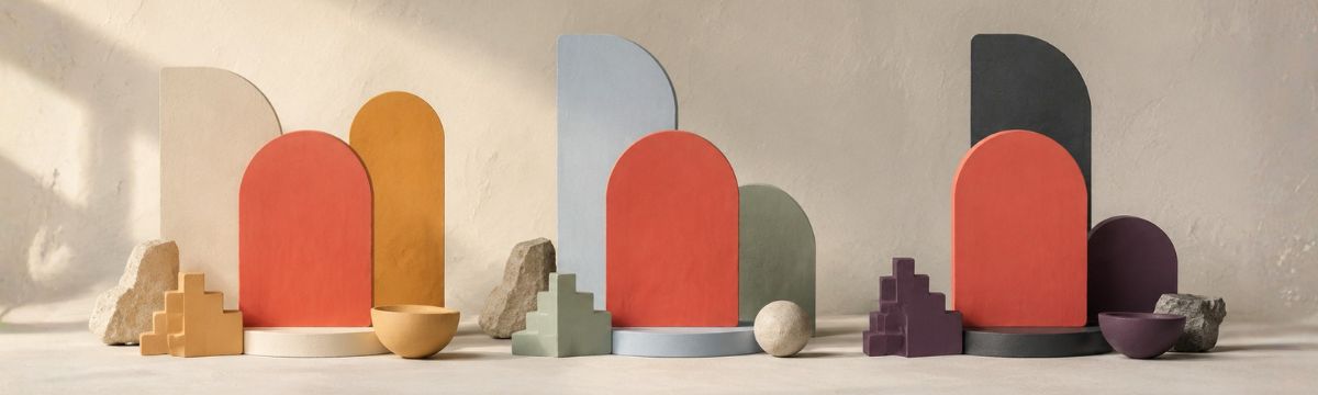
A pale blue and a deep navy belong to the same broad hue family, but they can communicate very differently.
A dusty pink and a vivid hot pink are both pink. One may feel gentle and nostalgic. The other may feel playful, energetic or deliberately loud.
A muted olive green and a luminous digital green can barely feel like members of the same family.
This is one reason Qolorio works with actual colors and palettes instead of treating every hue name as one fixed emotion.
Explore a color in Color Explorer
Light and dark change the mood
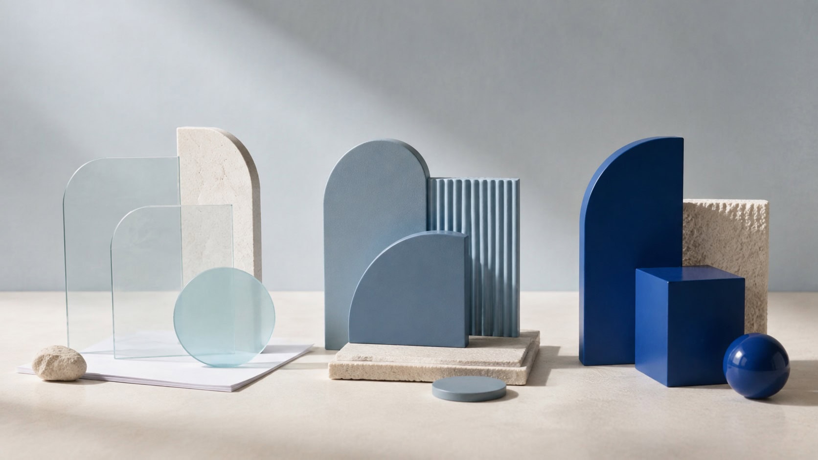
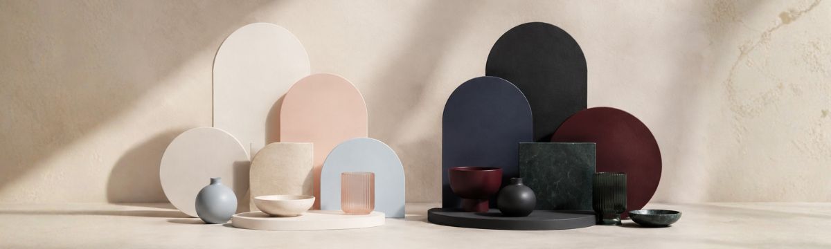
Lightness can change the emotional weight of a palette.
Lighter colors often feel more open, soft, airy or gentle. They can create space and reduce visual intensity.
Dark colors often feel heavier, deeper, more dramatic or more serious. They can create intimacy, contrast and visual authority.
Neither is automatically better.
A light palette can feel peaceful – or washed out.
A dark palette can feel sophisticated – or oppressive.
The difference comes from how the colors are balanced and what the design asks them to do.
Light changes more than brightness. It changes the atmosphere.
Saturation changes the volume
Saturation describes how vivid or muted a color feels.
Highly saturated colors tend to speak louder.
They can feel energetic, playful, intense, fresh or artificial depending on the hue and context.
Muted colors tend to feel quieter. They may suggest calm, restraint, age, softness, nature or sophistication. But again, there is no automatic result.
A muted palette can feel beautifully understated. It can also feel dull.
A vivid palette can feel joyful. It can also become exhausting when every color demands attention at the same time.
A good palette does not need every color to speak at the same volume.
If everything is an accent, nothing is.
Warm and cool colors
Colors are often described as warm or cool.
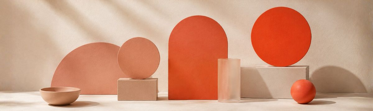
Reds, oranges and yellows usually sit on the warmer side.
Blues and many greens sit on the cooler side.
Warm colors are often associated with greater energy and arousal, while cooler colors are frequently associated with calmer or lower-arousal feelings.
But temperature is a direction, not a personality test.
A dark burgundy can feel quieter than an electric cyan.
A soft peach may be gentler than a saturated royal blue.
And a palette can deliberately combine warm and cool colors to create contrast, tension or balance.
Use temperature to understand relationships between colors rather than to put them into permanent emotional boxes.
What does red mean?
Red rarely goes unnoticed.
Red is frequently associated with energy, intensity and high arousal.
Depending on the context, it can suggest:
- love and attraction;
- passion;
- excitement;
- confidence;
- urgency;
- anger;
- danger;
- power.
That range is exactly what makes red interesting.
A warm tomato red beside cream can feel friendly and editorial.
A bright signal red on white can feel urgent.
A deep wine red with muted neutrals can feel rich and established.
A fluorescent red against black can feel aggressive, digital or high-energy.
Red in a palette
Use red when you want a palette to contain energy or a strong point of attention.
It does not need to dominate the whole design.
Sometimes one red accent in an otherwise quiet palette is more powerful than five different reds competing for attention.
In interfaces, remember that red is often used for errors or danger. If you also use it heavily as a brand or action color, make sure those meanings remain distinguishable.
Red is good at getting attention. Decide what you want it to say once it has it.
Explore red palettes in the Color Palette Library

What does orange mean?
Orange lives somewhere between heat and friendliness.
It often carries some of red’s energy while feeling less severe.
Orange can be associated with:
- warmth;
- enthusiasm;
- energy;
- friendliness;
- activity;
- playfulness;
- autumn;
- food and warmth.
A bright orange can feel youthful and energetic.
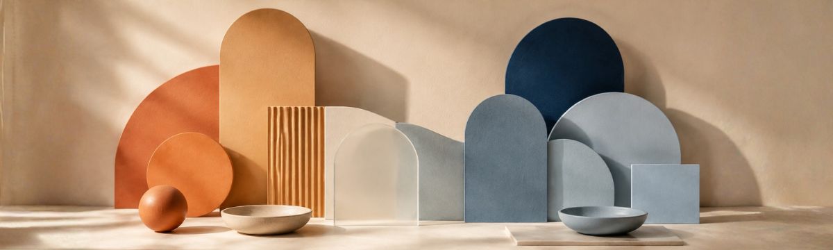
Terracotta can feel earthy and crafted.
Burnt orange can feel retro or autumnal.
A pale peach-orange can become soft and welcoming.
Orange in a palette
Orange works well when you want warmth without the intensity that pure red can bring.
It can make an effective accent in blue, teal, cream, brown or neutral palettes.
But vivid orange is visually assertive.
Give it enough quiet space around it.
Warm does not have to mean loud.

What does yellow mean?
Yellow brings light with it.
Yellow is often associated with positive and energetic emotions.
It can suggest:
- happiness;
- optimism;
- sunlight;
- energy;
- playfulness;
- curiosity;
- attention;
- caution.
That last combination is important.
Yellow can feel cheerful and welcoming, but it is also used for warnings and things that need to be noticed.
A soft butter yellow feels very different from a fluorescent safety yellow.
Yellow in a palette
Yellow can lift a palette without needing much space.
Use it as a small accent when you want brightness or energy.
Use softer yellows when you want warmth without turning the entire design into a signal.
And pay close attention to contrast.
Bright yellow can look visually intense while still having surprisingly low contrast against white and other light colors.
Check a yellow color combination
Bright is not the same as high contrast.

What does green mean?
Green carries a lot of the outside world with it.
Plants, leaves, growth and landscapes make nature one of the strongest associations around green.
Green can also suggest:
- growth;
- health;
- freshness;
- balance;
- calm;
- renewal;
- permission or success;
- sustainability.
But green has other cultural and contextual meanings too.
It can suggest money, technology, military environments, poison, jealousy or something synthetic depending on the shade and setting.
A sage green and a neon green tell very different stories.
Green in a palette
Green is extremely flexible.
Muted greens work naturally with earth tones and warm neutrals.
Clear greens can feel fresh and contemporary.
Dark forest greens can give a palette depth and weight.
Bright greens make strong action or status colors – but do not assume green alone is enough to communicate “success”.
Add text, icons or another visual signal when the meaning matters.
Green can suggest nature. It does not have to live in a forest.

What does blue mean?
Blue has range.
Across many studies, blue is frequently connected with calmer and lower-arousal associations.
It can suggest:
- calm;
- stability;
- distance;
- clarity;
- security;
- professionalism;
- water;
- sky;
- reflection;
- sadness.
That last point is useful.
Blue is often marketed as the automatic color of “trust”, but its emotional range is much broader.
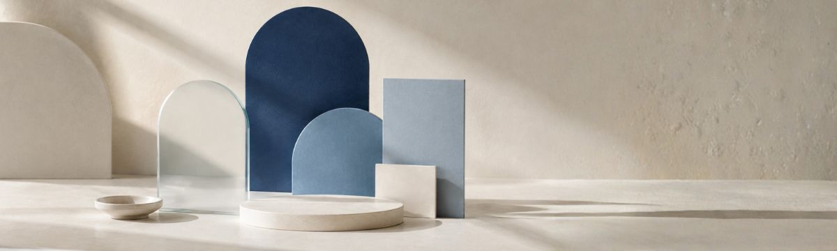
A pale sky blue can feel open and quiet.
A corporate medium blue can feel practical and familiar.
Navy can feel formal and controlled.
Electric blue can be energetic, technological or futuristic.
Blue in a palette
Because blue can move from very soft to very authoritative, it works in an enormous range of palettes.
Pair it with neutrals for restraint.
Combine it with orange for temperature contrast.
Use blue-greens for a cooler, more natural feeling.
Add violet or bright cyan when you want something more digital or expressive.
Blue can whisper, organize or glow.
Explore blue and neighboring colors
What does purple mean?
Purple rarely feels completely ordinary.
Purple and violet sit between warm red and cool blue, which gives them an unusual range.
They can suggest:
- creativity;
- imagination;
- luxury;
- ceremony;
- power;
- mystery;
- fantasy;
- spirituality.
But even the words used for purple, violet and lilac can carry somewhat different associations between languages and cultures.
A dark royal purple can feel rich and dramatic.
Lavender can feel gentle and reflective.
A saturated ultraviolet-style purple can feel futuristic, playful or digital.
Purple in a palette
Purple is useful when a palette needs character without going directly toward red or blue.
Pair it with warm neutrals for something more sophisticated.
Combine it with pinks for softness or playfulness.
Add cyan, electric blue or black for a more digital direction.
Purple is very good at refusing to be neutral.

What does pink mean?
Pink can be soft. It can also be fearless.
Pink is often associated with positive emotions, affection and playfulness.
Depending on its tone it may suggest:
- warmth;
- affection;
- tenderness;
- romance;
- fun;
- softness;
- youthfulness;
- confidence.
Cultural associations around gender have also strongly influenced how pink is interpreted, but they are neither universal nor fixed.
A dusty rose can feel mature and editorial.
A pale blush can feel subtle.
Hot pink can be bold, synthetic and energetic.
Pink in a palette
Pink changes dramatically depending on its neighbors.
With burgundy and cream it can become rich and elegant.
With orange it becomes warm and energetic.
With electric blue or purple it can feel digital and playful.
With gray it often becomes quieter and more controlled.
Soft color. Strong possibilities.

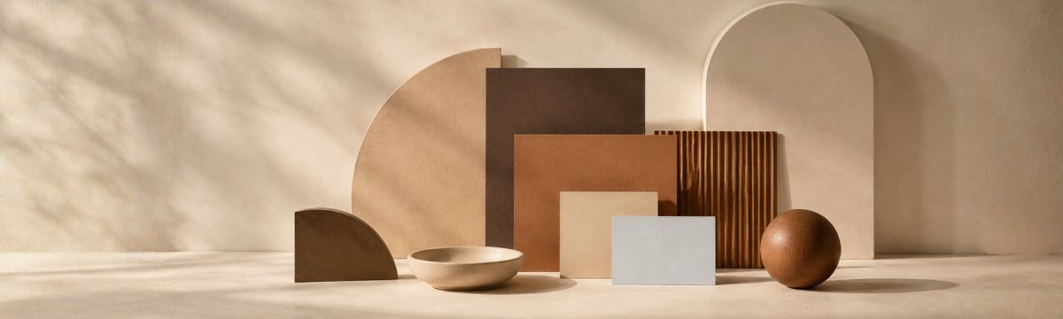
What does brown mean?
Brown is color with its feet on the ground.
Brown is closely connected with materials and the natural environment.
Think wood, soil, leather, coffee, clay and stone.
It can suggest:
- earthiness;
- warmth;
- craft;
- reliability;
- age;
- tradition;
- comfort;
- natural materials.
Brown can also feel heavy, old-fashioned or dull when the surrounding palette does not give it enough contrast or variation.
Brown in a palette
Brown becomes especially useful when treated as a family rather than one color.
Warm tan, deep chocolate, clay, caramel and near-black brown can create a complete palette with surprisingly little need for another hue.
Add cream for openness.
Add green for a natural direction.
Add orange or red for warmth.
Add blue for a strong cool–warm contrast.
Neutral does not have to mean gray.
What does white mean?
White creates room.
White is often associated with:
- clarity;
- simplicity;
- openness;
- cleanliness;
- quiet;
- lightness;
- space.
But white is not emotionally empty.
A large white background changes how every other color behaves.
It can make bright colors feel brighter and dark colors feel more decisive.
Pure white can also feel clinical or harsh when a warmer off-white would better suit the palette.
White in a palette
Think beyond #FFFFFF.
Warm whites, cool whites and very pale tinted colors can provide the breathing room of white while contributing to the atmosphere of the palette.
Sometimes the background is doing more work than the accent.

What does gray mean?
Gray is rarely the star. That is often the point.
Gray can suggest:
- neutrality;
- restraint;
- professionalism;
- calm;
- seriousness;
- quiet;
- distance;
- technology.
It can also feel dull, tired or impersonal when overused.
There is also no single gray.
A blue-gray feels cooler.
A warm gray can sit comfortably beside cream, brown and muted reds.
A nearly black charcoal can carry much more weight than a soft silver gray.
Gray in a palette
Gray is especially good at giving stronger colors somewhere to breathe.
Use it for structure, surfaces, typography or secondary information while allowing a more expressive color to carry the identity.
Just remember that gray text can lose contrast quickly when it becomes too light.
Check text and background contrast

What does black mean?
Black adds weight.
Black is frequently associated with powerful and darker emotional concepts.
Depending on context it can suggest:
- authority;
- elegance;
- formality;
- strength;
- mystery;
- seriousness;
- darkness;
- fear;
- grief.
A luxury identity can use black to create restraint and confidence.
A game interface may use it for atmosphere.
An editorial layout may use it simply because black text is extremely useful.
Black in a palette
Pure black is not always necessary.
Near-black navy, charcoal, deep brown or dark green can perform a similar structural role while keeping more of the palette’s character.
And when dark colors become backgrounds, test every foreground relationship again.
Dark backgrounds change the job of every color placed on top.

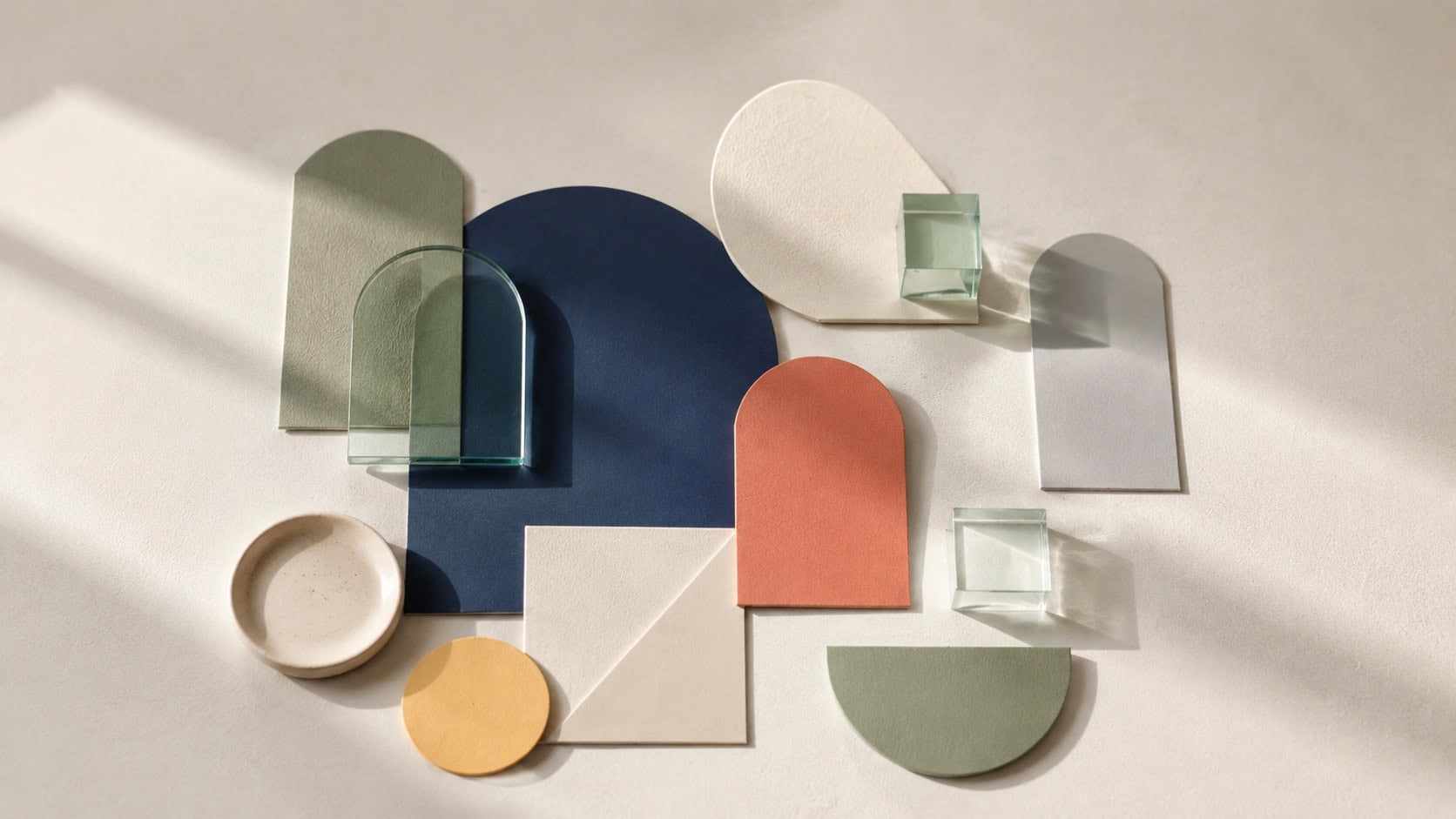
A palette has a meaning too
Individual colors matter.
The relationship between them matters more.
A palette of pale blue, soft gray and white may feel calm because several signals reinforce each other.
Replace the gray with fluorescent orange and the same blue suddenly plays a different role.
Add black and the palette may gain much more tension.
This is why choosing colors one at a time can be misleading.
A palette has:
- dominant colors;
- supporting colors;
- accents;
- light and dark relationships;
- warm and cool relationships;
- quiet colors;
- colors that demand attention.
Together they create an atmosphere.
A color has a voice. A palette is the conversation.
Calm palettes
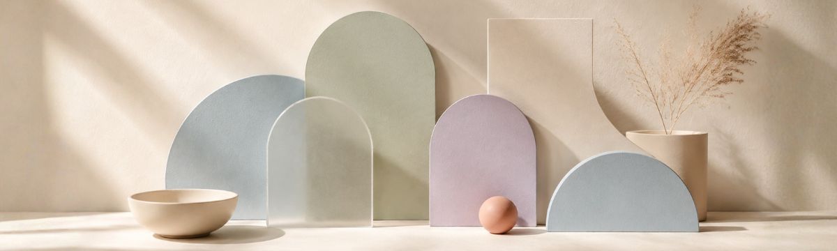
A calm palette often reduces visual competition.
That may mean:
- lower saturation;
- related hues;
- softer contrast in non-essential areas;
- plenty of light or neutral space;
- one restrained accent instead of several competing accents.
Blues and greens often appear in calm palettes, but calm does not require them.
Muted terracotta, warm cream and brown can be calm too.
So can lavender and gray.
The important part is not simply which hue you choose.
It is how much visual energy the palette creates.
Energetic palettes
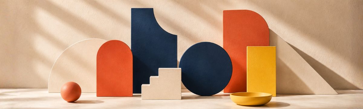
Energy usually comes from stronger differences.
Vivid colors, warmer hues, greater saturation and strong accent relationships can all increase the sense of activity.
But energetic does not mean random.
A palette can contain several powerful colors and still feel controlled if each one has a clear job.
Try allowing one color to dominate, one to support it and one to create a sharper moment of contrast.
Then use neutrals to give those colors room.
Energy needs rhythm too.
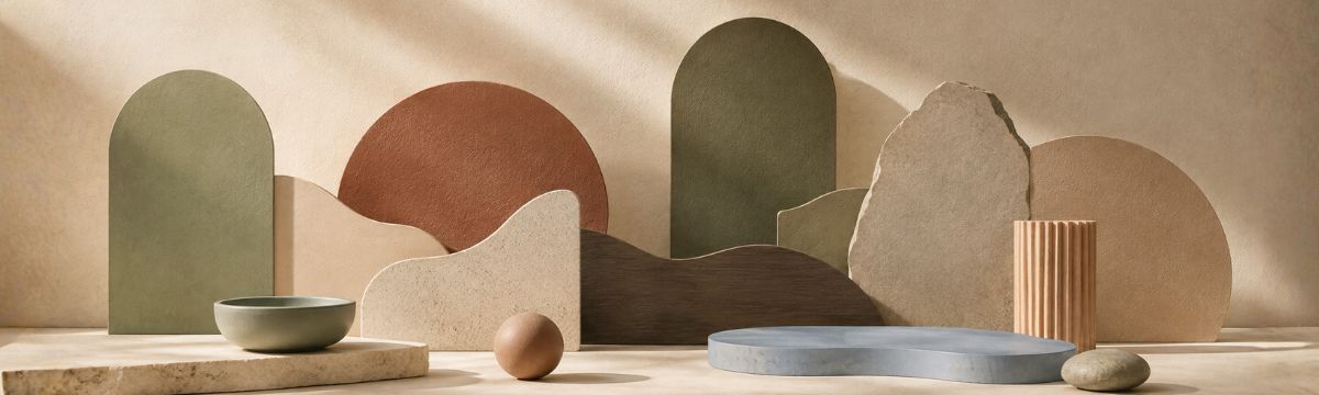
Natural and earthy palettes
Nature rarely gives you one isolated green.
It gives you systems.
Leaf green beside bark brown.
Sky beside stone.
Sand beside water.
Flowers against stems and shadows.
That is why photographs are such useful palette sources.
Instead of deciding that “nature means green”, extract the relationships that actually exist in an image.
You may discover that the color carrying the atmosphere is not the obvious one.
Nature is very good at palettes.
Professional does not have to mean blue
Certain visual conventions become popular because people recognize them quickly.
Blue is common in corporate, financial and technical interfaces.
That does not make blue the universal color of professionalism.
Professional design usually depends more on consistency, hierarchy, readability, restraint and appropriate context than on one particular hue.
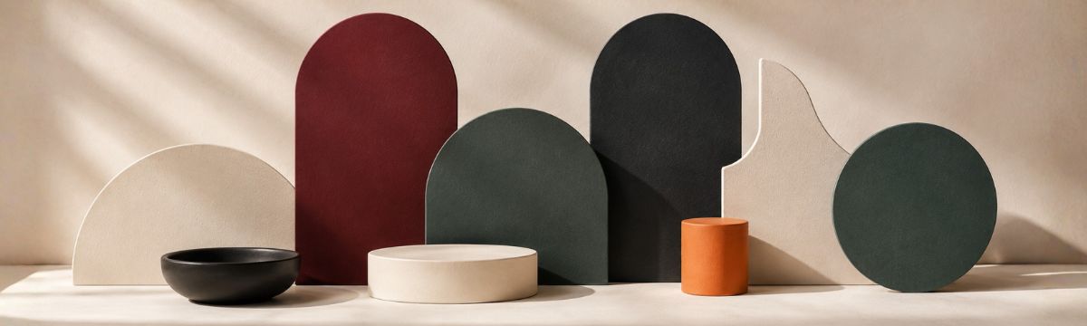
A burgundy palette can be professional.
So can forest green.
So can black, cream and orange.
The palette needs to support the job.
It does not need to copy the category.
Playful does not have to mean rainbow
Playfulness can come from color, but also from relationships.
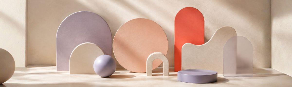
A bright accent on a restrained background can feel playful.
Unexpected warm–cool combinations can create personality.
Pastels can feel playful without being loud.
One strange color in an otherwise orderly palette can be enough.
Use Surprise Me, Color Mixer or the Library when you want to move beyond the first combination you would normally choose.
Your palette needs jobs, not just feelings
Mood can help you choose a direction.
A working design needs more.
Once you like the feeling of a palette, ask what the colors actually need to do.
Which color is the page background?
Which one carries body text?
Where does the accent appear?
What happens on a button?
Which color represents an error?
How is a selected state different from an inactive one?
This is where Qolorio Studio moves from palette to color system.
Use semantic roles to connect the colors you chose with the actual jobs they need to perform.
Mood starts the conversation. Roles make the palette useful.
Meaning depends on context
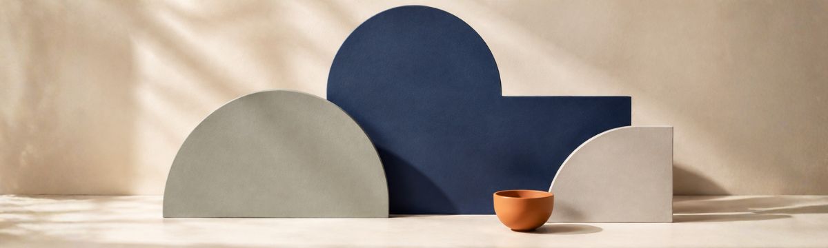
The same palette can feel different in a financial dashboard, an album cover, a children’s illustration and a fashion brand.
Typography changes it.
Photography changes it.
Spacing changes it.
The amount of each color changes it.
Even the words on the page change it.
A dark red beside the word SALE does not have the same context as the same dark red on the cover of a historical novel.
That is why Qolorio Preview places the palette into different kinds of designs.
Do not only ask:
Do I like these colors?
Also ask:
Do they still make sense when they have something to do?
Culture matters
Color associations are not identical everywhere.
Language, geography, traditions, religion, history, products, politics and personal experience can all influence what a color suggests.
Some associations are remarkably widespread.
Others are much more local.
If a design is intended for a specific culture or audience, research that context instead of assuming a generic color-psychology chart applies everywhere.
This matters especially when color carries symbolic, ceremonial, political or social meaning.
A global color can still have a local story.
Personal experience matters too
Not everyone has the same memories of a color.
The green that reminds one person of a peaceful landscape may remind someone else of a school uniform.
A particular yellow may feel nostalgic because it resembles a childhood kitchen.
A blue may belong to a favorite sports team, a workplace or an app someone uses every day.
Design cannot predict every individual association.
It does not need to.
The goal is to understand common signals without pretending they erase personal experience.

Color meaning is not color accessibility
A color can communicate exactly the feeling you want and still be difficult to use.
Beautiful pale gray text may not have enough contrast.
Red and green may be perfectly on-theme while being too difficult to distinguish when they are the only signals in a chart.
A sophisticated dark palette may become frustrating if interactive controls disappear into the background.
Meaning and accessibility are related design questions, but they are not the same question.
Use the mood to choose a direction.
Then test the actual relationships.
Check a palette across color-vision simulations
Feeling right does not automatically mean working well.
Do not rely on color alone
If a color carries important information, give that information another way to be understood.
Pair status colors with labels.
Use icons as well as color.
Give selected elements a shape, position, border or text treatment.
Make links recognizable.
Make focus visible.
A red error state is stronger when it also includes an error icon and a clear message.
A green success state is more useful when it actually says Success.
Color can strengthen meaning.
It should not be the only place where meaning lives.
Start with a feeling. Then build a palette.
Sometimes a project begins with an exact brand color.
Sometimes it begins with an image.
And sometimes it begins with a sentence:
It should feel calm.
It should feel energetic.
It should feel warm, but not childish.
It should feel technical without becoming cold.
That is enough to start exploring.
Use the Qolorio Color Palette Library when you want ready-made directions.
Use Image Color Picker when the feeling already exists in an image.
Use Color Explorer when you already have one color.
Use Color Mixer when you want to discover what happens between two colors.
And use Studio when the colors need to become an actual system.
Browse the Color Palette Library
There is no perfect emotional palette
Good. That would be boring.
Color research can reveal patterns.
Color theory can explain relationships.
Contrast calculations can tell you whether two colors are sufficiently different for a particular use.
None of those tools can decide exactly how your design should feel.
That still belongs to you.
Use associations as clues.
Use context as evidence.
Use accessibility as a requirement.
Then look at the palette.
Change something.
Look again.
Color has meaning. You still get to decide what you mean.
Some content and tools were created with AI assistance and human review. Visuals may be AI-generated, manually designed, or a combination of both. Despite careful review, errors may occur.