Sample text
12.93:1 — Passes AA for normal text
Text #000000
Background #DCC8B0
Color palette
Use this color as a starting point: copy its HEX code, find matching colors, or set it as the Base color in Color Studio.
Opening Color Studio uses this color as the Base color in a new project. Generate a palette only when you are ready.
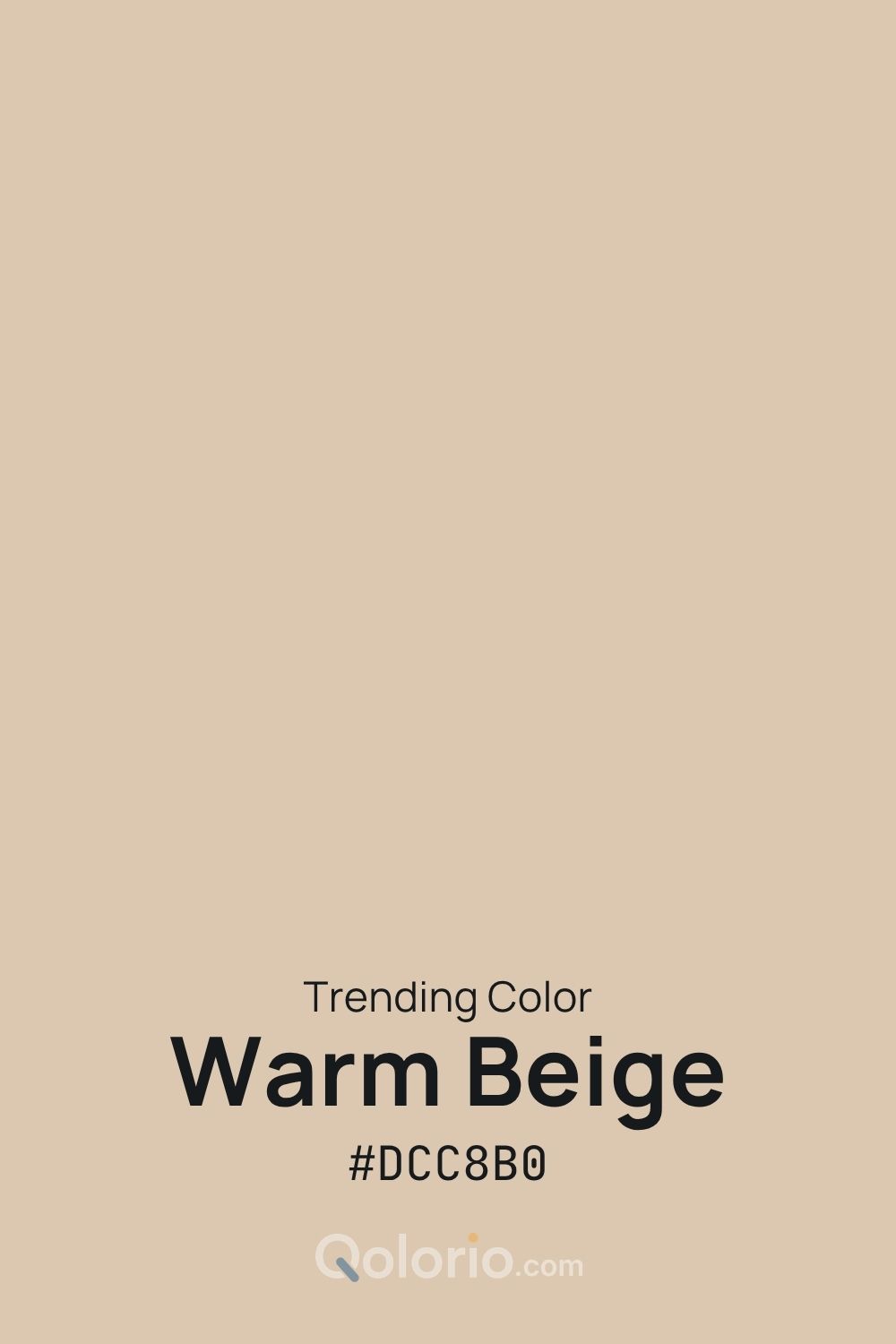
Warm Beige #DCC8B0 is a soft, creamy neutral with a subtle warm undertone. It creates an easy foundation for interiors, branding, packaging, web design and editorial layouts without feeling stark. Pair it with deep brown for grounded contrast, terracotta for added warmth, sage for a natural direction, or off-white for a light and restrained tonal scheme.
Use this exact HEX value to explore readable text, two layouts and three palette directions. The examples are starting points: check text and controls again in your finished design.
12.93:1 — Passes AA for normal text
Text #000000
Background #DCC8B0
1.62:1 — Fails AA for normal text
Text #FFFFFF
Background #DCC8B0
10.76:1 — Passes AA for normal text
Text #171A1D
Background #DCC8B0
9.40:1 — Passes AA for normal text
Text #DCC8B0
Background #2C241C
Calculated for opaque sRGB colors. AA for normal text requires at least 4.5:1; the result uses the unrounded value. These checks describe the shown pairs, not every combination or the accessibility of a complete design.
These are Qolorio design examples. Open one in Studio to keep the shown colors and role choices, then try them in the available previews.
STUDIO NOTES
A fresh perspective
A considered space for ideas and details.
A considered choice of color.
Explore the storyA light page and dark text leave room for the original color as a feature panel. Check the panel label against its actual background.
#F9F7F6 / #2C241C · 14.29:1#4A3C2B / #F8FAFC · 10.18:1STUDIO NOTES
Made to be noticed
A focused setting for a new collection.
A considered choice of color.
See the collectionThe original color becomes a feature panel. The action uses it when it stands out against the dark page; otherwise a lighter companion takes that job.
#2C241C / #F9F7F6 · 14.29:1#DCC8B0 / #171A1D · 10.76:1A light foundation, the original color, dark tones for structure and a soft companion. Check text contrast wherever you place type.
#F9F7F6 #DCC8B0 #2C241C #4A3C2B #E6DFD6
Pair the original color with a warm accent and dark text for a cover, article or presentation. Keep the accent small.
#F7F5EF #DCC8B0 #2C241C #C6835D
A cool supporting palette for surfaces and information. Add a readable label or shape when color carries meaning.
#F5F8FA #DCC8B0 #314E63 #D8E2E9