Sample text
9.53:1 — Passes AA for normal text
Text #000000
Background #A4B494
Color palette
Use this color as a starting point: copy its HEX code, find matching colors, or set it as the Base color in Color Studio.
Opening Color Studio uses this color as the Base color in a new project. Generate a palette only when you are ready.
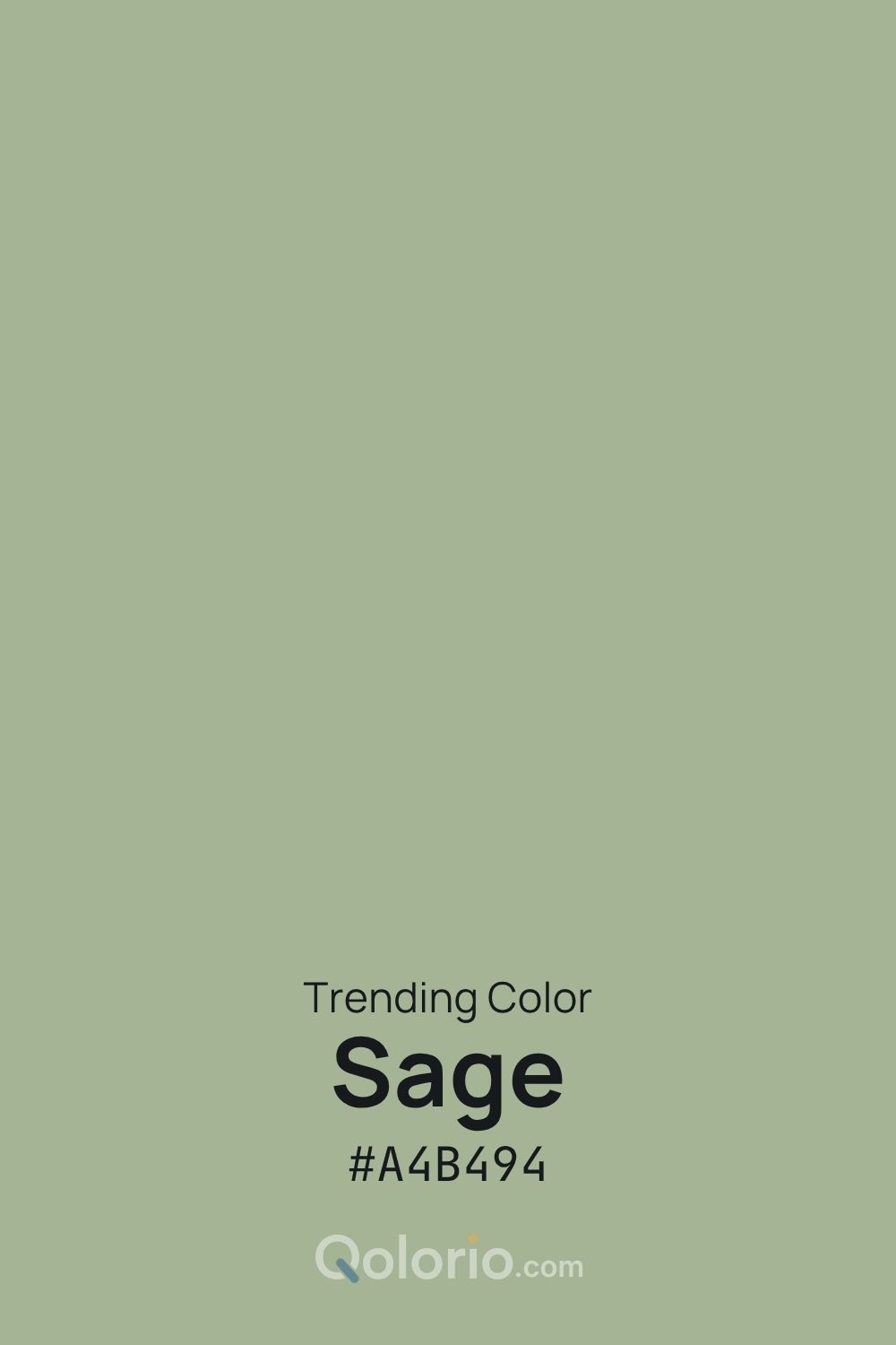
Sage #A4B494 is a soft, desaturated green that feels calm, natural and understated. It suits interiors, wellness branding, packaging, web design and editorial projects that benefit from a gentle neutral-like color. Pair it with warm beige, cream and off-white for a soft scheme, or use deeper greens and earthy browns to add structure and contrast.
Sage is a name used for a range of muted greens. This page explores Qolorio’s chosen shade, #A4B494. Use the exact HEX value when sharing it: another palette may use “sage” for a different color.
This shade can work as a soft surface or accent. Choose dark labels on this sage: white text does not provide enough contrast.
9.53:1 — Passes AA for normal text
Text #000000
Background #A4B494
2.20:1 — Fails AA for normal text
Text #FFFFFF
Background #A4B494
6.08:1 — Passes AA for normal text
Text #263228
Background #A4B494
6.08:1 — Passes AA for normal text
Text #A4B494
Background #263228
Calculated for opaque sRGB colors. AA for normal text requires at least 4.5:1; the result uses the unrounded value. These checks describe the shown pairs, not every combination or the accessibility of a complete design.
These are Qolorio design examples. Open one in Studio to keep the shown colors and role choices, then try them in the available previews.
STUDIO NOTES
A little room to grow
Notes on plants, spaces and slower days.
A considered choice of color.
Read the journalWarm off-white carries the page. Sage marks a feature panel, dark green anchors text and actions, and beige is reserved for decoration.
#F6F4EC / #263228 · 12.15:1#2D3B2F / #F6F4EC · 10.72:1STUDIO NOTES
Ideas after hours
A small collection of thoughtful creative work.
A considered choice of color.
Explore the workSage highlights the heading and action against deep green. Off-white carries longer text. Dark button labels avoid weak white-on-sage contrast.
#263228 / #F6F4EC · 12.15:1#A4B494 / #263228 · 6.08:1Off-white as the main surface, sage for panels, deep greens for text and actions, and a small beige accent.
#F6F4EC #A4B494 #263228 #2D3B2F #DCCBAE
A light publication or cover: terracotta supplies a small warm accent while dark text carries the information.
#F7F5EF #A4B494 #263238 #B26B50
Light surfaces and blue-toned dark text. Use sage for a selected item together with a visible label or shape.
#F5F7F2 #A4B494 #334D5C #D7E0E6