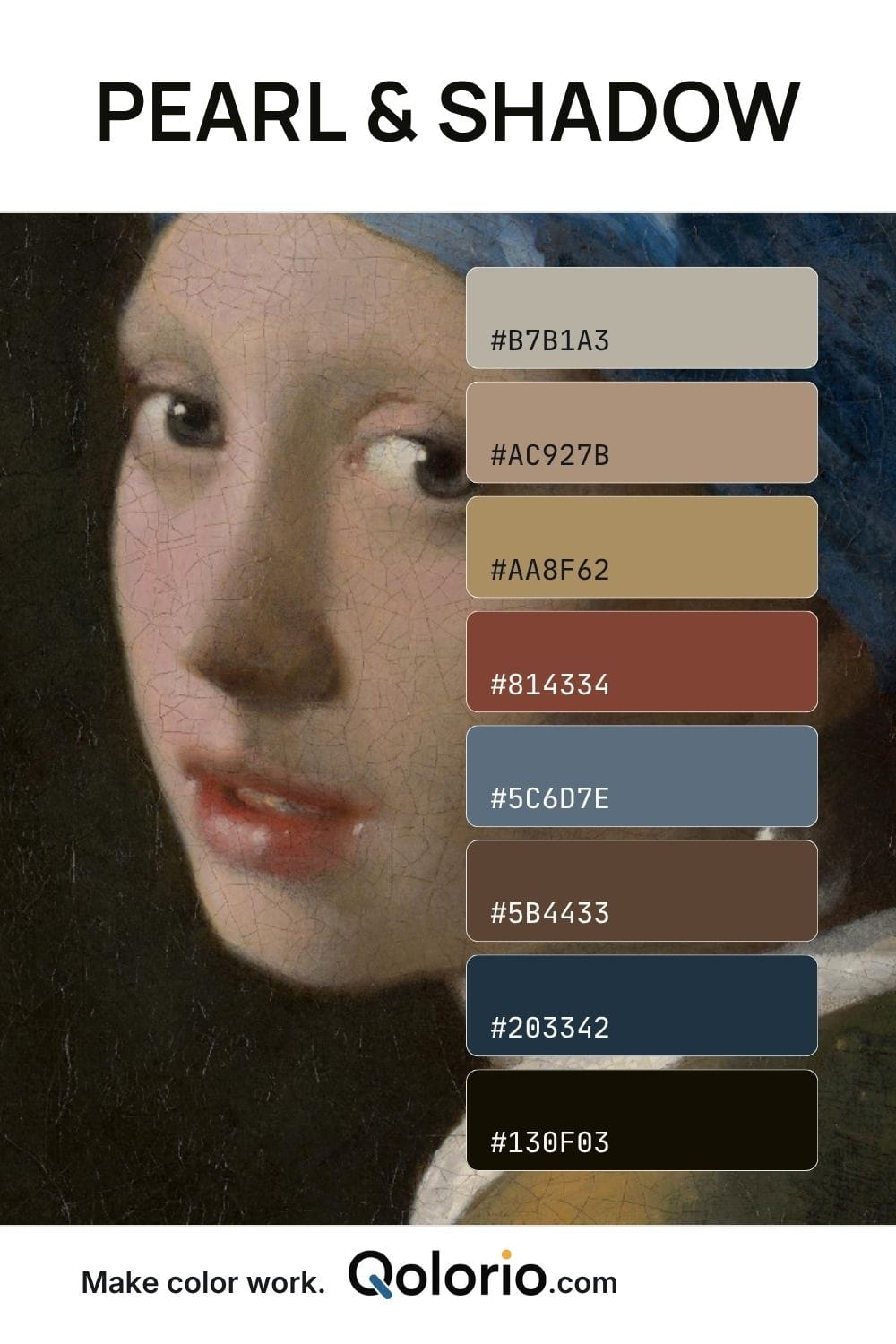
Make this palette your own: copy individual colors, copy all 8 HEX codes, or continue in Color Studio.
Opening Color Studio transfers this palette to a new project in the same browser.
Muted portrait tones balanced by slate blue and deep shadow
Pearl & Shadow combines taupe, beige, antique gold, earthy brown, slate blue and near-black in a restrained, painterly palette. Warm neutrals dominate, while the blue introduces a cooler counterpoint that gives the combination more dimension. It works well for editorial design, heritage branding, interiors and refined packaging. Use the light neutrals for softness and the navy-black tones for precise contrast.